 Last Update: February 7, 2023
Everybody knows, that a popup is a powerful marketing tool. It has to be eye-catching and striking. And you know what? You can design a popup without a designer’s help! Let’s have a look at the style settings which are all you need to create a successful popup.
General Style
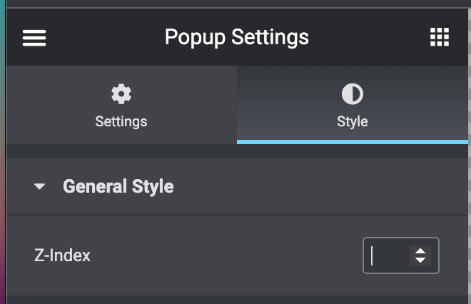
- Z-index – which you can use to place the popup either in the background or the foreground of the other elements.
Container
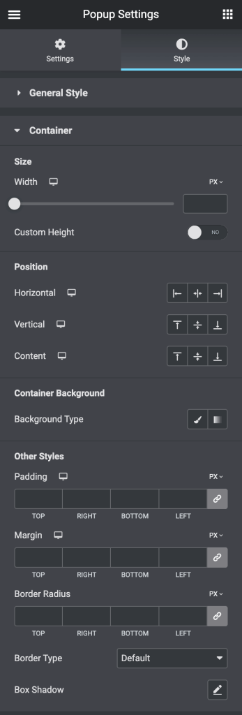
- Size
- Width – set the width of the container
- Custom Height – turn it on to add a custom height for the container
- Position
- Horizontal – Choose the horizontal position for the container (Left / Center / Right)
- Vertical – Choose the vertical position for the container (Top / Center / Bottom)
- Content – Choose the position for the content
- Container Background
- Background Type – in this block you can choose, whether you want to use classic or gradient type for the container. The customization options vary for each type.
- Other Styles
- Padding – here you can set the preferable custom padding. Fill in the values for the top, bottom, right, and left padding in pixels or % to apply your custom padding.
- Margin – input the values for the margins in the required fields.
- Border Radius – here you can set the border-radius to make the angles more smooth and round.
- Border Type – here you can select the needed type of border to use for the container.
- Box Shadow – here you can apply the shadow for the container and change the shadow’s settings, such as color, blur, spread, and position.
Close Button
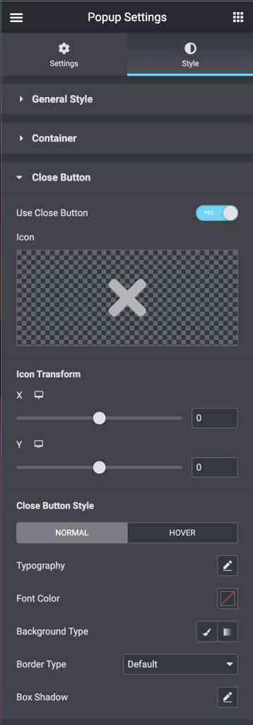
- Use Close Button – you can decide if you want to show the Close button. Toggle the Use Close Button to Yes to display the Close button.
- Icon – Choose the icon from the Elementor icons library.
- Icon Transform – you can change the position of the Close button moving it along the x-axis and y-axis.
- Close Button Style
- Typography – turn the option on to view the typography settings.
- Font Color – here you can change the color of the icon
- Background Type – in this block you can choose, whether you want to use classic or gradient type for the close button. The customization options vary for each type.
- Border Type – here you can select the needed type of border to use for the close button.
- Box Shadow – here you can apply the shadow for the close button and change the shadow’s settings, such as color, blur, spread, and position.
Overlay
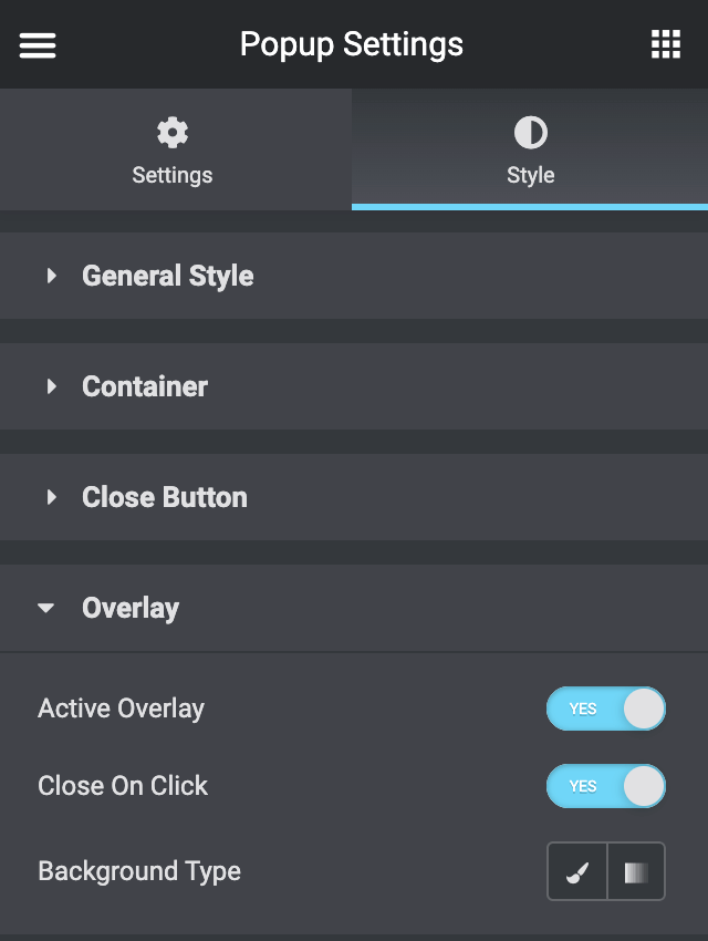
- Active Overlay – toggle the Active Overlay option to Yes, so that the overlay appears over the page content.
- Close On Click – you can enable the Close On Click option.
- Background Type – in this block you can choose, whether you want to use classic or gradient type for the overlay. The customization options vary for each type.