 Last Update: September 26, 2022

Progress Bar and Circle Progress widgets assist you when you need to visualize the information and want the numbers to speak for you. You can use them to display the stages of a process, and progress, use them to compare several items.
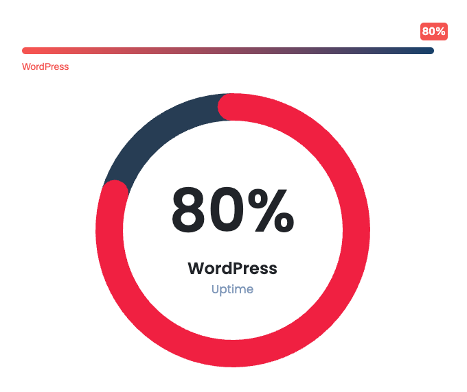
Progress Sample
Content
there are two types of progress (Bar & Circle). based on your choice the options change.
Bar
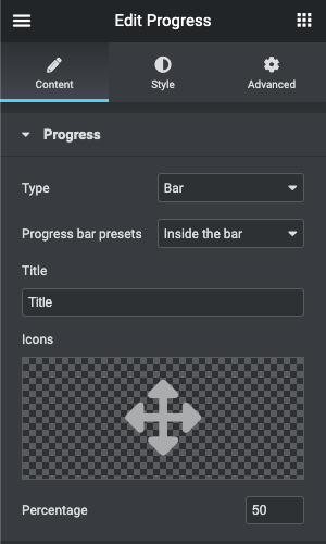
- Progress bar presets: There are several types of progress bar positioning for the content that comes with the progress bar.
- Title: Define the title for the progress
- Icon: Choose the icon from Elementor icons Library
- Percentage: Specify the state of the progress bar you’re currently editing.
Circle
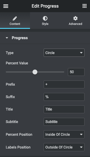
- Percent value: Specify the state of the progress circle you’re currently editing.
- Prefix: Specify the prefix value for the number
- Suffix: Specify the suffix value for the number
- Title: Define the title for the progress
- Sub Title: Define the subtitle for the progress
- Percent Position: Choose between “inside of Circle” and “outside of Circle”
- Labels Position: Choose between “inside of Circle” and “outside of Circle”
Style
Bar
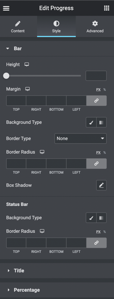
- Bar
- Height: Specify the progress bar height
- Margin: Specify the margins.
- Background Type: Choose, whether you want to use classic or gradient type for the bar. The customization options vary for each type.
- Border Type: Select the needed type of border to use.
- Border Radius: Set the border radius to make the angles more smooth and round.
- Box Shadow: Apply the shadow and change the shadow’s settings, such as color, blur, spread, and position.
- Status Bar
- Background Type: Choose, whether you want to use classic or gradient type for the status bar The customization options vary for each type.
- Border Radius: Set the border radius to make the angles more smooth and round.
- Title
- Alignment: Align the title to the left, right, or center.
- Background Type: Choose, whether you want to use classic or gradient type for the title. The customization options vary for each type.
- Border Type: Select the needed type of border to use.
- Border Radius: Set the border radius to make the angles more smooth and round.
- Box Shadow: Apply the shadow and change the shadow’s settings, such as color, blur, spread, and position.
- Padding: Set the preferable custom padding. Fill in the values for the top, bottom, right, and left padding in pixels or % to apply your custom padding.
- Margin: Specify the margins.
- Icon
- Color: Set the color for the icon.
- Icon Size: Set the font size for the icon.
- Margin: Specify the margins.
- Text
- Color: Choose the color of the text.
- Typography: Change the typography options for the text.
- Alignment: Align the title vertical to the top, middle, or bottom.
- Percentage
- Alignment: Align the percentage to the left, right, or center.
- Background Type: Choose, whether you want to use classic or gradient type for the percentage. The customization options vary for each type.
- Border Type: Select the needed type of border to use.
- Border Radius: Set the border radius to make the angles more smooth and round.
- Box Shadow: Apply the shadow and change the shadow’s settings, such as color, blur, spread, and position.
- Margin: Specify the margins.
- Padding: Set the preferable custom padding. Fill in the values for the top, bottom, right, and left padding in pixels or % to apply your custom padding.
- Color: Set the color for the percentage.
- Typography: Change the typography options for the percentage.
- Suffix Font Size: Specify the font size for the suffix
- Percent Suffix Alignment: Align the suffix vertical to the top, middle, or bottom.
Circle
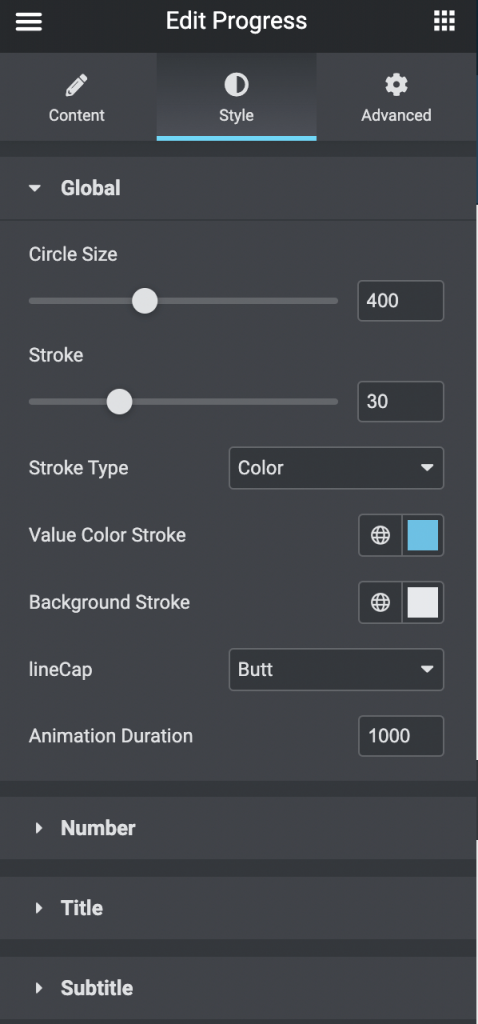
- Global
- Circle Size: Specify the Circle Size.
- Stroke: Specify the Circle stroke.
- Stroke Type: Choose between Color and Gradient. and choose the colors.
- LineCap: Choose between “Butt”, “Round”, and “Square”.
- Animation Duration: Specify the time in Milliseconds.
- Number
- Color: Set the color for the number.
- Typography: Change the typography options for the number.
- Padding: Set the preferable custom padding. Fill in the values for the top, bottom, right, and left padding in pixels or % to apply your custom padding.
- Prefix Font Size: Specify the font size for the prefix
- Prefix Gap: Specify the gap for the prefix
- Prefix Alignment: Align the prefix vertical to the top, middle, or bottom.
- Suffix Font Size: Specify the font size for the suffix
- Suffix Gap: Specify the gap for the suffix
- Suffix Alignment: Align the suffix vertical to the top, middle, or bottom.
- Alignment: Align the number to the left, right, or center.
- Title
- Color: Set the color for the title.
- Typography: Change the typography options for the title.
- Padding: Set the preferable custom padding. Fill in the values for the top, bottom, right, and left padding in pixels or % to apply your custom padding.
- Alignment: Align the number to the left, right, or center.
- SubTitle
- Color: Set the color for the subtitle.
- Typography: Change the typography options for the subtitle.
- Padding: Set the preferable custom padding. Fill in the values for the top, bottom, right, and left padding in pixels or % to apply your custom padding.
- Alignment: Align the number to the left, right, or center.