 Last Update: May 25, 2020

Heading widget allows you to create stylish title headings.
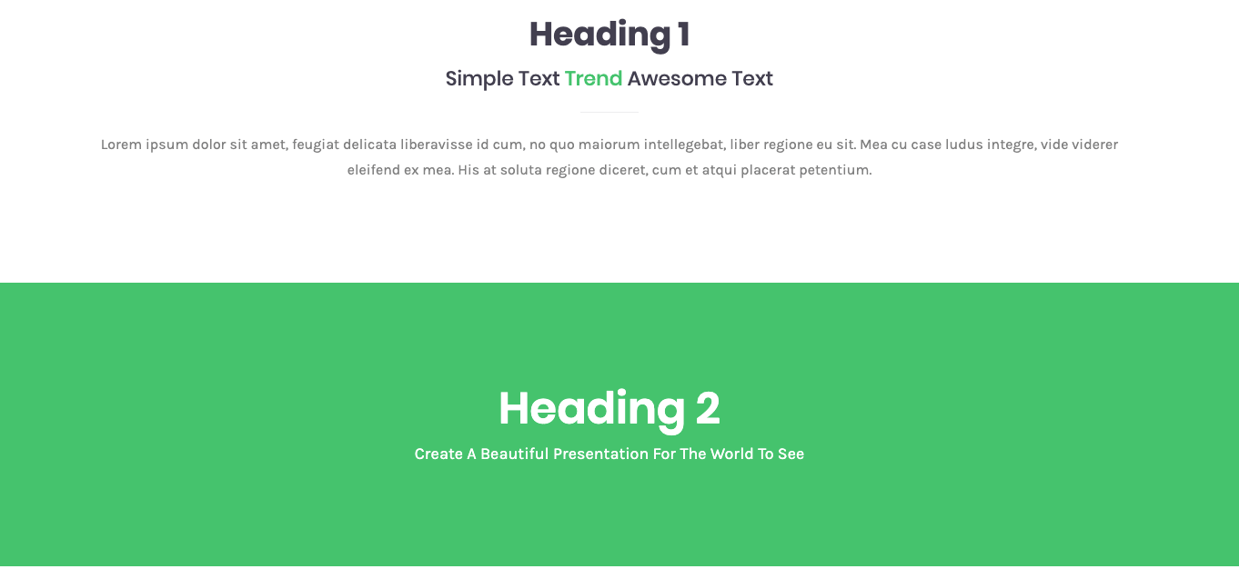
Heading widget Sample
On the picture below you can view Heading widget sample.

Layout

- Show Heading – enable this option if you need to show the Heading.
- Show SubHeading – enable this option if you need to show the SubHeading.
- Show Description – enable this option if you need to show the Description.
- Display Divider – enable this option if you need to show the Divider.
- Divider Position – choose the divider position, there are 4 options, [ Before Heading, Between Heading, After Heading, After Description ]
Content
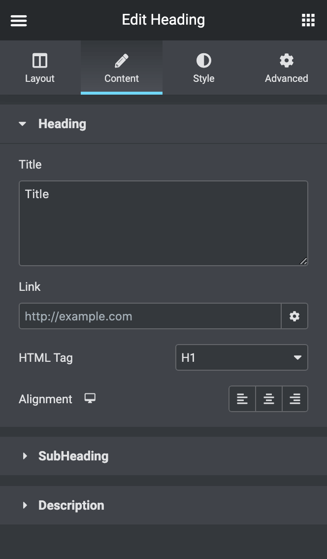
- Heading – here you will find a bunch of options to customize heading.
- Title – Type your heading text.
- Link – Link the heading to a URL.
- HTML Tag – Set the heading’s HTML tag to H1- H6.
- Alignment – Align the Widget to the left, right, or center.
- SubHeading – here you will find a bunch of options to customize SubHeading.
- Before Text – Type your text before Highlight text.
- Highlight Text – Type your Highlight text.
- After Text – Type your text after Highlight text.
- Link – Link the SubHeading to a URL.
- HTML Tag – Set the sub-headings HTML tag to H1- H6.
- Description – here you can type the description of the block.
Style
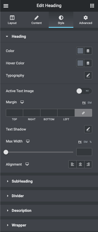
- Heading – here you will find a bunch of options to customize the heading.
- Color – Choose the color of the heading text.
- Hover Color – Choose the hover color of the heading text.
- Typography – Change the typography options for the heading text.
- Active Text Image – if you enable this you can add a background into the text and customize it.
- Margin – here you can define the margins for the Heading.
- Text Shadow – Add a shadow and blur to the heading text.
- Max Width – here you can add maximum width to the heading.
- Alignment – Align the heading to the left, right, or center.
- SubHeading – here you will find a bunch of options to customize the sub-heading.
- Color – Choose the color of the sub-heading text.
- Hover Color – Choose the hover color of the sub-heading text.
- Typography – Change the typography options for the sub-heading text
- Margin – here you can define the margins for the sub-Heading.
- Text Shadow – Add a shadow and blur to the sub-heading text.
- Max Width – here you can add maximum width to the sub-heading.
- Highlighted Text – here you will find a bunch of options to customize the Highlighted Text.
- Color – Choose the color of the Highlighted text.
- Typography – Change the typography options for the Highlighted text.
- Margin – here you can define the margins for the Highlighted text.
- Text Shadow – Add a shadow and blur to the Highlighted text.
- Alignment – Align the Sub-heading to the left, right, or center.
- Divider – here you will find a bunch of options to customize the divider.
- Weight – here you can add weight to the Divider.
- Width – here you can add width to the Divider.
- Margin – here you can define the margins for the Divider.
- Color – Choose the color of the Divider.
- Box Shadow – enable this option if you want to access the shadow advanced settings, and need to apply shadow to the item.
- Alignment – Align the Divider to the left, right, or center.
- Description – here you will find a bunch of options to customize the description.
- Description Color – Choose the color of the Description text.
- Typography – Change the typography options for the Description text.
- Margin – here you can define the margins for the Description text.
- Max Width – here you can add maximum width to the Description.
- Alignment – Align the description to the left, right, or center.
- Wrapper – here you will find a bunch of options to customize the wrapper.
- Width – here you can add the width to the widget.
- Height – here you can add the height to the widget.
- Margin – here you can define the margins for the widget.
- Padding – here you can define the padding for the widget.