 Last Update: July 17, 2021

Countdown Timer widget is a helpful tool if you need to embed a timer with a countdown to your website’s page. The widget has multiple settings, such as Numbers color, font, and custom background for the timer.
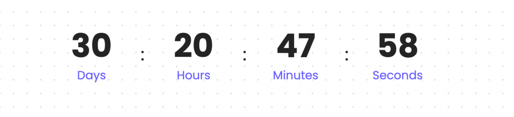
Countdown Timer Widget Sample
On the pictures below you can view the countdown timer widget sample.
Content
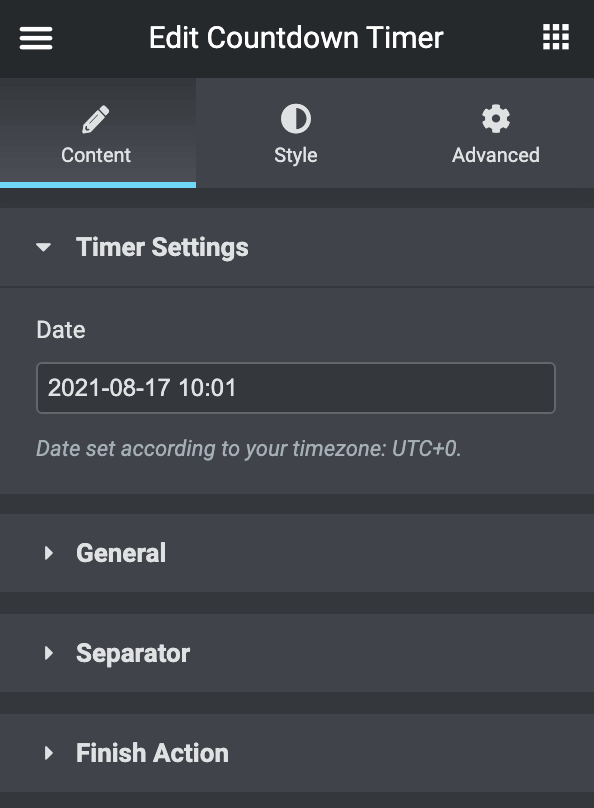
Timer Settings
- Date: here you need to input the date to finish the countdown according to your time zone.
General
- Text Label
- Days Label: here you can change the standard days label to your custom name.
- Hours Label: here you can change the standard hours label to your custom name.
- Minutes Label: here you can change the standard minutes label to your custom name.
- Seconds Label: here you can change the standard seconds label to your custom name.
Separator
- Display Separator: switch it off to hide the separator.
- Separator Type: here you can choose between Solid or Dotted or you can input your custom separator to divide days, hours, minutes, and seconds.
Finish Action
- Action After Finish:
- Redirect
- Redirect URL: here you can set the link that you need to redirect to after the timer finish.
- Show Message:
- Message: here you can write the message that you need to show after the timer finish.
- Show Template:
- Template: here you can set an Elementor template to show after the timer finish.
- Hide Timer: here you can remove the timer after it’s finished.
- Redirect
Style
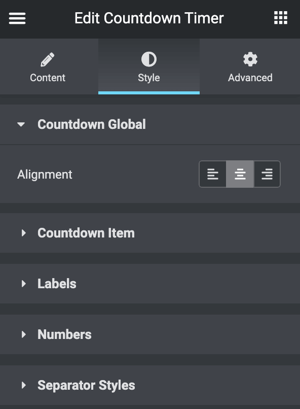
Countdown Global
- Alignment: here you can select the needed alignment for the widget (left, center, right).
Countdown Item
- Background Type: in this block, you can choose, whether you want to use classic or gradient type for the background. The customization options vary for each type.
- Item Padding: here you can set the padding for each individual block.
- Item Margin: here you can set the margin for each individual block.
- Border Type: here you can define the type of border you need to use for the individual block.
- Box Shadow: enable this option if you want to access the shadow advanced settings for this widget, and need to apply shadow for it.
- Alignment: here you can select the needed alignment for the widget Content (left, center, right).
- Size: here you can select if you want to use auto-size, or you would rather use fixed size for the items. If you choose the fixed width for the items, you’ll be able to set the width and height in pixels in the blocks below.
- Order: here you can rearrange the block label and numbers.
Labels
- Color: here you can define the suitable color for the countdown timer label. Use the color picker tool to select the necessary color.
- Typography: turn the option on to view the typography settings.
- Background Type: in this block, you can choose, whether you want to use classic or gradient type for the background. The customization options vary for each type.
- Padding: here you can set the padding for the label.
- Margin: here you can set the margin for the label.
- Border Type: here you can define the type of border you need to use for the label.
- Border radius: here you can set the border-radius for the chosen border to make the border angles more round.
- Box Shadow: enable this option if you want to access the shadow advanced settings for this widget, and need to apply shadow for it.
Numbers
- Color: here you can define the suitable color for the countdown timer number. Use the color picker tool to select the necessary color.
- Typography: turn the option on to view the typography settings.
- Background Type: in this block, you can choose, whether you want to use classic or gradient type for the background. The customization options vary for each type.
- Padding: here you can set the padding for the number.
- Margin: here you can set the margin for the number.
- Border Type: here you can define the type of border you need to use for the number.
- Border radius: here you can set the border-radius for the chosen border to make the border angles more round.
- Box Shadow: enable this option if you want to access the shadow advanced settings for this widget, and need to apply shadow for it.
- Number Item Style
- Background Type: in this block, you can choose, whether you want to use classic or gradient type for the background. The customization options vary for each type.
- Padding: here you can set the padding for the internal number box.
- Margin: here you can set the margin for the internal number box.
- Border Type: here you can define the type of border you need to use for the internal number box.
- Border radius: here you can set the border-radius for the chosen border to make the border angles more round.
- Box Shadow: enable this option if you want to access the shadow advanced settings for this widget, and need to apply shadow for it.
Separator Styles
- Color: here you can define the suitable color for the countdown timer separator. Use the color picker tool to select the necessary color.
- Size: here you can adjust the font size for the separator content.
- Font: here you can adjust the font family for the separator content.
- Margin: here you can set the margin for the internal separator content.