 Last Update: August 20, 2021

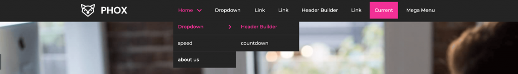
Nav Menu widget allows you to display links to pages and preferably design them. Also, this widget makes it easy to create a menu and place it in the website’s header and footer built with Elementor.
Nav Menu Widget Sample
Content
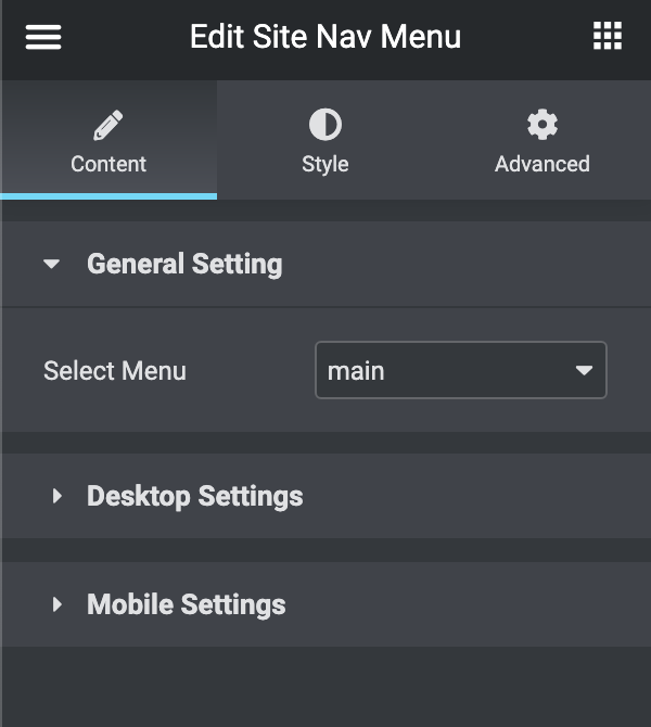
- General Settings:
- Select Menu: you can select one of the available menus (main, secondary, footer).
- Desktop Settings:
- Layout: you can set the menu layout to vertical or horizontal.
- Vertical: you can set the dropdown Placement (left side, right side, at the bottom).
- Top Dropdown Icon: choose the dropdown icon for the first level of the menu.
- Sub Dropdown Icon: choose the sub dropdown icon for the second level of the menu.
- Menu Alignment: align the menu [left – right – center – justified].
- Layout: you can set the menu layout to vertical or horizontal.
- Mobile Settings:
- Enable Mobile Trigger: turn the switch off if you need to disable the mobile trigger.
- Layout: you can choose from different layouts for Mobile Menu (Default, Full width, Slide Left, Slide Right).
- Alignment: align the menu [left – right – center – justified].
- Icon: choose the trigger icon for the mobile menu.
- Close Icon: choose the close icon for the mobile menu.
Style
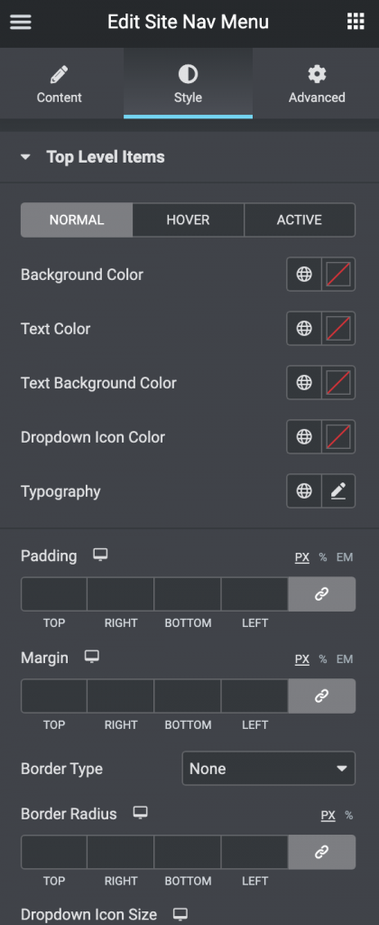
- Top Level Items: you can customize the top-level items in three modes (Normal, Hover, Active)
- Vertical Menu Width: you can set the vertical menu width (this shows in case you activated the vertical menu).
- Vertical Menu Alignment: align the menu [left – right – center] (this shows in case you activated the vertical menu).
- Background Color: set the background color for the full item.
- Text Color: set the text color for the item.
- Text Background Color: set the background color for the text block of the item.
- Dropdown Icon Color: set the color for the dropdown icon.
- Typography: turn the option on to view the typography settings.
- Padding: here you can set the preferable custom padding. Fill in the values for the top, bottom, right, and left padding in pixels or % to apply your custom padding.
- Margin: specify the margin for the item
- Border: here you can select the needed type of border to use for the item
- Border Radius: here you can set the border-radius to make the angles more smooth and round.
- Dropdown Icon Size: here you can set the dropdown icon size.
- Gap Before Dropdown Icon: here you can set the space that you need between the text and the icon.
- Dropdown
- Container Styles: these styles apply to the items container
- Container width: set the dropdown container width.
- Background Color: set the background color for the dropdown container.
- Border Type: here you can select the needed type of border to use for the dropdown container.
- Border Radius: here you can set the border-radius to make the angles more smooth and round.
- Box Shadow: here you can apply the shadow for the dropdown container and change the shadow’s settings, such as color, blur, spread, and position.
- Padding: here you can set the preferable custom padding. Fill in the values for the top, bottom, right, and left padding in pixels or % to apply your custom padding.
- Gap Before 1st Level Sub: here you can set the space you need between the item and the dropdown container.
- Gap Before 2nd level Sub: here you can set the space you need between the dropdown container and the sub-dropdown.
- Items Styles: these styles apply to the inner items.
- Typography: turn the option on to view the typography settings.
- Normal – Hover – Active: you can switch between the modes for the following options:
- Background Color: set the background color for the item.
- Text Color: set the text color for the item.
- Padding: here you can set the preferable custom padding. Fill in the values for the top, bottom, right, and left padding in pixels or % to apply your custom padding.
- Dropdown Icon Size: here you can set the dropdown icon size.
- Gap Before Dropdown Icon: here you can set the space that you need between the text and the icon.
- Divider
- Border Type: here you can select the needed type of border to use for the item.
- Container Styles: these styles apply to the items container
- Mobile Trigger
- Normal – Hover: you can switch between the modes for the following options:
- Background Color: set the background color for the trigger button.
- Text Color: set the text color for the trigger button.
- Border Type: here you can select the needed type of border to use for the trigger button.
- Border Radius: here you can set the border-radius to make the angles more smooth and round.
- Width: here you can set the trigger button width.
- Height: here you can set the trigger button height.
- Icon size: here you can set the trigger button size.
- Normal – Hover: you can switch between the modes for the following options:
- Mobile Menu
- Background Color: set the background color for the Mobile Menu.
- Padding: here you can set the preferable custom padding. Fill in the values for the top, bottom, right, and left padding in pixels or % to apply your custom padding.
- Box Shadow: here you can apply the shadow for the Mobile menu and change the shadow’s settings, such as color, blur, spread, and position.