 Last Update: July 8, 2021

Table widget has a lot of customization settings so that you can style it up as you need. With the help of this widget, you are able to create a schedule, classify the information, etc.
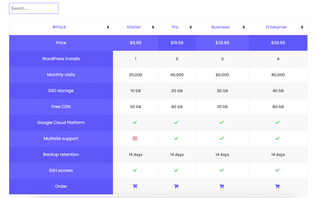
Table widget sample
On the pictures below you can view the Table widget sample.
Content
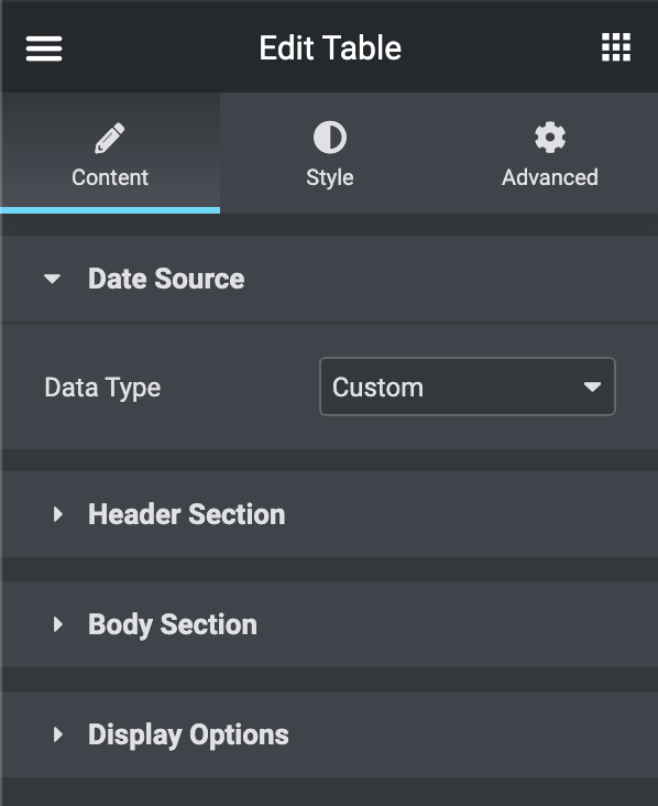
Data Source
- Data Types
- Custom: Fill in the table content.
- CSV: import CSV file inside the table.
Header Section
- Content
- Text: type the heading title.
- Add icon/image: add icon or image to the heading.
- Settings
- Column Span: type the number of columns that the heading should take its place.
- Colum Width: type the column width.
- Style
- Color: Choose the heading text color.
- Background Color: Choose the heading background color.
Body Section
- Action
- Start New Row: choose it to start a new table row.
- Add Custom Style
- Color: Choose the column text color.
- Background Color: Choose the column background color.
- Add Custom Style
- Add New Cell: choose it to add a column in the table row.
- Content
- Text: type the column content.
- Link: link the column content to a URL.
- Add Icon/Image: choose to add an icon or image to the column content.
- Settings
- Column Span: type the number of columns that the column should take its place.
- Row Span: type the number of rows that the column should take its place.
- This Cell is table Heading?: Switch it on in case you need to make a Cell as a Heading Column.
- Style
- Color: Choose the column Color.
- Background Color: Choose the column background color.
- Content
- Start New Row: choose it to start a new table row.
Display Options
- Sorting Table: Turn it on in case you need to enable the sorting in the table.
- Search Table: Turn it on in case you need to enable the search box in the table.
- Responsive Table: Turn it on in case you need to enable the responsiveness in the table.
Style
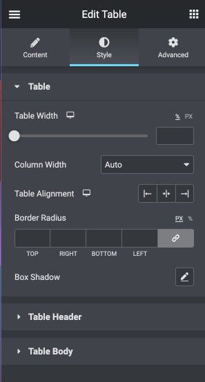
Table
- Table Width: type the table width.
- Column Width
- Auto: Choose it in case that you need the table width based on content.
- Fixed: Choose it in case that you need all columns to have the same width.
- Table Alignment: choose the text alignment inside the table.
- Border Radius: here you can set the border radius to make the angles more smooth and round.
- Box Shadow: here you can apply the shadow for the tab content and change the shadow’s settings, such as color, blur, spread, and position.
Table Header
- Typography: turn the option on to view the typography settings.
- Switch between Normal & Hover modes to customize the Heading Columns.
- Color: here you can change the Heading Columns text color to the one you want.
- Background Color: in this block, you can choose, whether you want to use classic or gradient type for the Heading Columns. The customization options vary for each type.
- Padding: here you can set the preferable custom padding. Fill in the values for the top, bottom, right, and left padding in pixels or % to apply your custom padding.
- Border Type: here you can select the needed type of border to use for the Heading Columns.
- Hidden border for header container: in case that you need to disable the border for the Heading Columns.
- Alignment: here you can set the alignment of the Heading Columns and make it different for different screen resolutions.
- Vertical Alignment: here you can set the vertical alignment of the Heading Columns and make it different for different screen resolutions.
- Icon
- Font Size: here you need to customize the size of the icon and make it responsive.
- Color: here you can change the color of the icon to be shown in the Heading Columns.
- Gap: here you can add the space between the heading column text and the icon.
- Image
- Width: here you can set the image width.
- Gap: here you can add the space between the image and heading column content.
- border-radius: here you can set the border-radius to make the angles more smooth and round.
- Sorting Icon
- Font Size: here you need to customize the size of the icon and make it responsive.
- Color: here you can change the Icon color to the one you want.
Table Body
- Typography: turn the option on to view the typography settings.
- Switch between Normal & Hover modes to customize the Body Columns.
- Row Color: here you can change the Body Columns text color to the one you want.
- Row Background Color: in this block, you can choose, whether you want to use classic or gradient type for the Body Columns. The customization options vary for each type.
- Striped Rows: turn it on to add a different color for even and odd column
- Even Row Color: here you can change the Body Even Columns text color to the one you want.
- Even Row Background Color: in this block, you can choose, whether you want to use classic or gradient type for the Body Even Columns. The customization options vary for each type.
- Link Color: Choose the link color inside the Body Columns.
- Padding: here you can set the preferable custom padding. Fill in the values for the top, bottom, right, and left padding in pixels or % to apply your custom padding.
- Border Type: here you can select the needed type of border to use for the Body Columns.
- Hidden border for body container: in case that you need to disable the border for the Body Columns.
- Alignment: here you can set the alignment of the Body Columns and make it different for different screen resolutions.
- Vertical Alignment: here you can set the vertical alignment of the Body Columns and make it different for different screen resolutions.
- Icon
- Font Size: here you need to customize the size of the icon and make it responsive.
- Color: here you can change the color of the icon to be shown in the Body Columns.
- Gap: here you can add the space between the Body column text and the icon.
- Image
- Width: here you can set the image width.
- Gap: here you can add the space between the image and Body column content.
- border-radius: here you can set the border-radius to make the angles more smooth and round.