 Last Update: May 23, 2020

Testimonials widget is useful beyond comparison when it comes to adding your clients’ positive feedbacks to your site. Feel free to style up the testimonials and add the beautiful testimonials carousel right to your web page in several clicks!
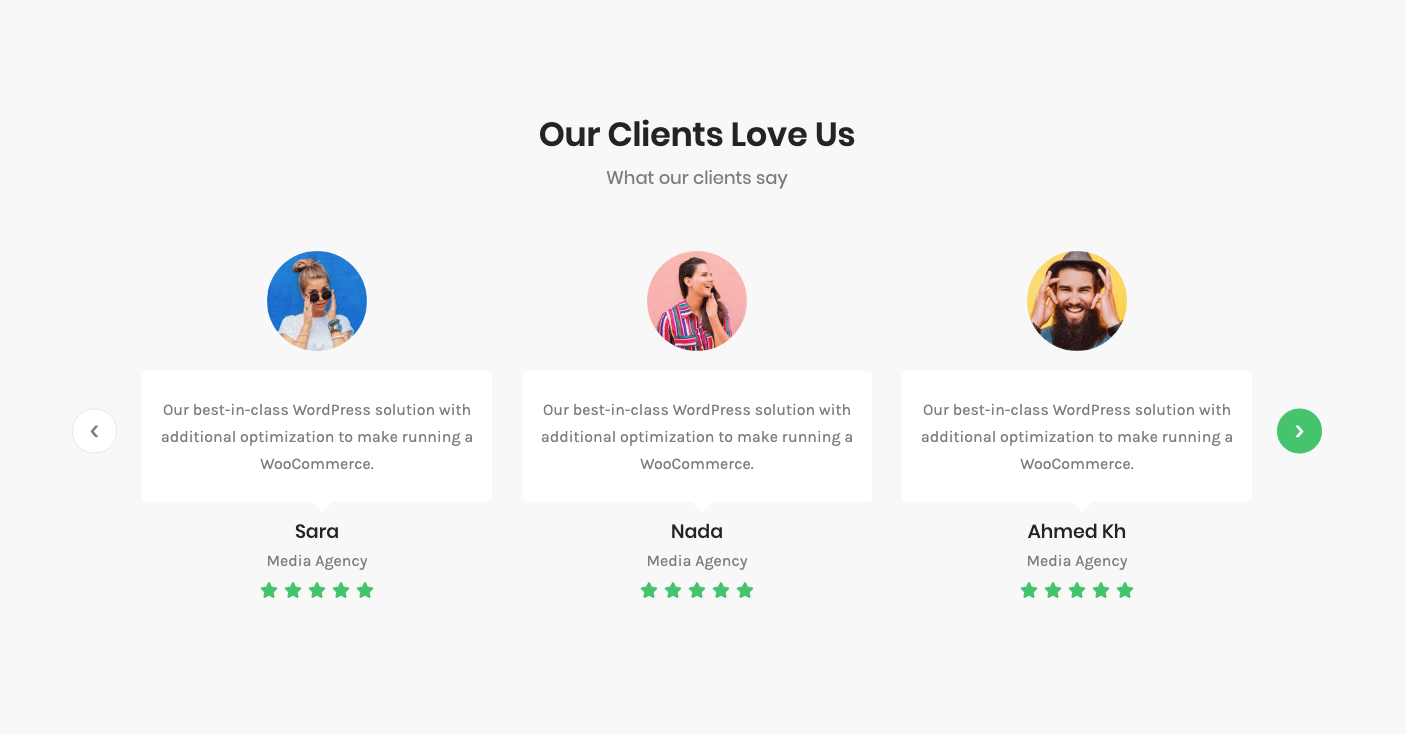
Testimonials widget Sample
On the picture below you can view Testimonials widget sample.
Layout
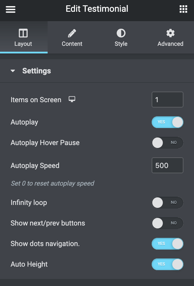
- Items on Screen – here you can specify how many items you want to show per section column (use 1 if you want to create a testimonials slider or specify the number of testimonials to create a carousel).
- Autoplay – enable this option in order to play the testimonials automatically.
- Autoplay Hover Pause – the slider/carousel will be paused when on hover.
- Autoplay Speed – here you can set the autoplay speed in ms.
- Infinite Loop – enable this option if you need the testimonials to play infinitely.
- Show next/prev Buttons – enable this option if you’re using testimonials slider. The navigation arrows will be added to the right and left sides of the slider.
- Show Dots Navigation – enable this option if you’re using testimonials carousel.
- Auto Height – enable this option if you need the testimonial carousel height to be Automatic.
Content
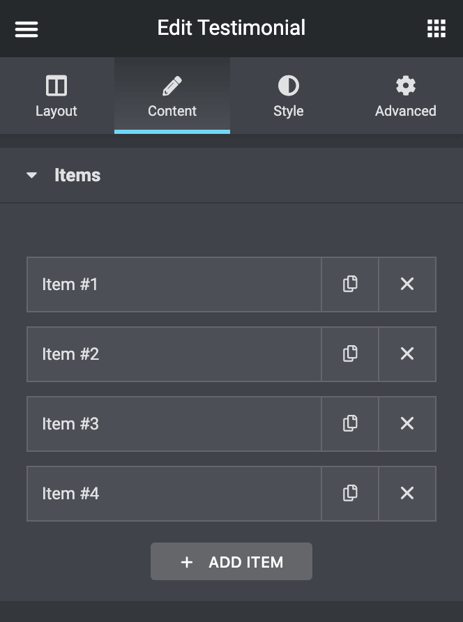
Click Add Item button to add a new testimonial to the widget.
- Image – here you can add the photo of the feedback author.
- Icon – here you can select the icon to use for the testimonial.
- Title – input the title of the testimonial.
- Comment – here you need to add the testimonial text.
- Name – here you should input the name of the testimonial author.
- Link – here you should input the link of the testimonial author.
- Position – here you should add the testimonial author’s work responsibilities.
- Date – here you can add the date when the testimonial was published.
- Rating – here you can choose the author’s rating in stars.
Style
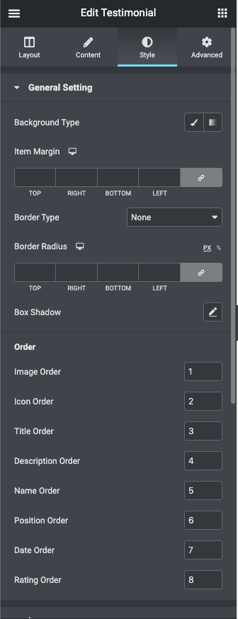
General Setting
- Background Type – in this block you can choose, whether you want to use classic or gradient background type.
- Item Margin – here you can define the margins for the Testimonials item.
- Border Type – here you can define the type of the border you need to use for the element.
- Border Radius – here you can set the border-radius for the chosen border to make the border angles more round.
- Box Shadow – enable this option if you want to access the shadow advanced settings, and need to apply shadow to the item.
- Order – here you can reorder the widgets blocks, by specifying the numbers in ascending order.
Image
- Alignment — here you can define the preferable image alignment. The image can be placed to the left, to the right, or remain centered.
- Width – use controls to set the needed image width or type in the width value in px or % in the corresponding block.
- Height – use controls to set the needed image height or type in the height value in px or % in the corresponding block.
- Margin – here you can define the margins for the Testimonials image item.
- Border Type – here you can define the type of the border you need to use for the image.
- Border Radius – here you can set the border-radius for the chosen border to make the border angles more round.
- Box Shadow – enable this option if you want to access the shadow advanced settings, and need to apply shadow to the image.
Icon
- Alignment – here you can define the alignment of the preferable icons. They can be placed to the left, to the right, or remain centered.
- Icon Color – here you can specify the color of the testimonials icons using color picker tool.
- Icon Background Color – here you can set the color to use it as the icon background.
- Icon Font Size – use the controls to change the icon size or type in the size value in px in the corresponding field.
- Width – here you can define the width of the border in px or EM.
- Height – here you can define the height of the border in px or EM.
- Margin – here you can define the margins for the Testimonials icon.
- Border Type – here you can select border type for the icon boxes.
- Border Radius – here you can set the border-radius for the chosen border to make the border angles more round.
- Box Shadow – enable this option if you want to access the shadow advanced settings, and need to apply shadow to the icon boxes.
Title
- Custom Width – enable this option to apply your custom width to the title of the testimonial.
- Text Alignment – use this option to set the needed text alignment for the testimonials title text.
- Alignment – here you can define the preferable title alignment. It can be placed to the left, to the right, or to remain centered.
- Color – here you can set the title color using color picker tool.
- Typography – turn the option on to view the typography settings.
- Padding – here you can set the preferable custom padding for the title. Fill in the values for the top, bottom, right, and left padding in pixels or % to apply your custom padding.
- Margin – here you can define the margins for the Testimonials title.
Comments
- Text Alignment – use this option to set the needed text alignment for the testimonials comment text.
- Alignment – here you can define the preferable comment alignment. It can be placed to the left, to the right, or to remain centered.
- Color – here you can set the comment color using color picker tool.
- Typography – turn the option on to view the typography settings.
- Width – here you can set the necessary comment width using controls or input the width value in px or % in the corresponding field.
- Use Comment Corner – enable this option to decorate the comment block with the arrows pointing at the comment authors.
- Color – here you can set the comment corner color using color picker tool.
- Corner position – here you can change the comment corner position (move the controls to the left or to the right to change the position).
- Corner Width – here you can set the comment corner width.
- Corner Height – here you can specify the comment corner height.
- Corner Skew – here you can set the angle of the comment corner skew.
- Background Type – in this block you can choose, whether you want to use classic or gradient background type. The customization options vary for each type.
- Padding – here you can set the preferable custom padding for the comment. Fill in the values for the top, bottom, right, and left padding in pixels to apply your custom padding.
- Margin – here you can define the margins for the Testimonials comment.
- Border Type – here you can select border type for the comment.
- Border Radius – here you can set the border-radius for the chosen border to make the border angles more round.
- Box Shadow – enable this option if you want to access the shadow advanced settings, and need to apply shadow to the comment boxes.
Name
- Text Alignment – use this option to set the needed text alignment for the testimonials author’s name text.
- Custom Width – enable this option to apply your custom width to the testimonials author’s name.
- Width – here you can use the controls to set the necessary name width or input the width value in px or % in the corresponding window.
- Color – here you can set the name text color using color picker tool.
- Hover Color – here you can set the name text hover color using color picker tool.
- Typography – turn the option on to view the typography settings.
- Padding – here you can set the preferable custom padding for the author’s name. Fill in the values for the top, bottom, right, and left padding in pixels to apply your custom padding.
- Margin – here you can define the margins for the Testimonials author’s name.
Position
- Text Alignment – use this option to set the needed text alignment for the testimonials author’s position text.
- Custom Width – enable this option to apply your custom width to the testimonials author’s position.
- Width – here you can use the controls to set the necessary position width or input the width value in px or % in the corresponding window.
- Color – here you can set the position text color using color picker tool.
- Typography – turn the option on to view the typography settings.
- Padding – here you can set the preferable custom padding for the author’s name. Fill in the values for the top, bottom, right, and left padding in pixels to apply your custom padding.
- Margin – here you can define the margins for the Testimonials author’s position.
Date
- Text Alignment – use this option to set the needed text alignment for the testimonials author’s Date text.
- Custom Width – enable this option to apply your custom width to the testimonials author’s Date.
- Width – here you can use the controls to set the necessary position width or input the width value in px or % in the corresponding window.
- Color – here you can set the position text color using color picker tool.
- Typography – turn the option on to view the typography settings.
- Padding – here you can set the preferable custom padding for the author’s date. Fill in the values for the top, bottom, right, and left padding in pixels to apply your custom padding.
- Margin – here you can define the margins for the Testimonials author-date.
Rating
- Stars – use this option to set the needed color for the regular stars
- Active Stars – use this option to set the needed color for the Active stars
- Size – here you can set the stars font size.
- Spacing – here you can set the space between the stars.
- Margin – here you can define the margins for the Testimonials author-date.
- Stars Style – here you can choose from the two styles for the stars solid or outline.
- Active Stars Style – here you can choose from the two styles for the Active stars solid or outline.
Arrows
Here you can switch from customizing arrows in the Normal mode to styling them up in Hover mode. To do it just switch between this two modes.
- Background Type – in this block you can choose, whether you want to use classic or gradient background type.
- Font Color – here you can change the color of the arrows using the color picker.
- Font Size – here you can change the size of the navigation arrows.
- Width – here you can define the width of the arrow.
- Height – here you can define the height of the arrow.
- Border Type – here you can select border type for the arrows boxes.
- Width – here you can define the width of the border.
- Color – here you can change the color of the arrow box borders.
- Border Radius – here you can set the border-radius for the chosen border to make the border angles more round.
- Box Shadow – enable this option if you want to access the shadow advanced settings, and need to apply shadow to the navigation arrow boxes.
- Prev Arrow Position
- Vertical Position by – select Top or Bottom position.
- Top Indent – here you can specify the top indent size of the Prev arrow.
- Horizontal Position by – select Left or Right position.
- Left indent – here you can set the left indent size of the Prev arrow.
- Next Arrow Position
- Vertical Position by – select Top or Bottom position.
- Top Indent – here you can specify the top indent size of the Next arrow.
- Horizontal Position by – select Left or Right position.
- Right indent – here you can set the right indent size of the Next arrow.
Dots
Here you can switch from customizing arrows in the Normal mode to styling them up in Hover mode and Active mode. To do it just switch between this three modes.
- Alignment – here you can define the alignment of the preferable dots. They can be placed to the left, to the right, or remain centered.
- Gap – use controls to minify or make larger the gap space between the dots.
- Dots Box Margin – here you can define the margins for the dots.
- Background Type – in this block you can choose, whether you want to use classic or gradient background type.
- Box Size – in this block you can specify the size of the dots boxes.
- Border Type – here you can select border type for the dots boxes.
- Width – here you can define the width of the border in px.
- Color – here you can change the color of the dot boxes borders.
- Box Shadow – enable this option if you want to access the shadow advanced settings, and need to apply shadow to the navigation arrow boxes.