 Last Update: June 4, 2023

WHMCS Price Table widget is helpful when you need to auto-import your products in one click and showcase the prices and services your company provides in an attractive and clear way. The widget has multiple options and versatile customization settings and is easy to use.
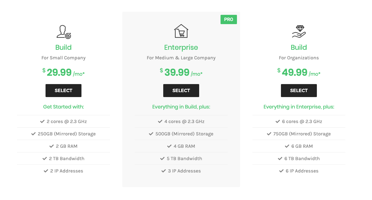
WHMCS Price Table Widget Sample
In the picture below you can view the Price Table widget sample.
Create API Credentials in WHMCS
How to create API Credentials in WHMCS?
check this tutorial.
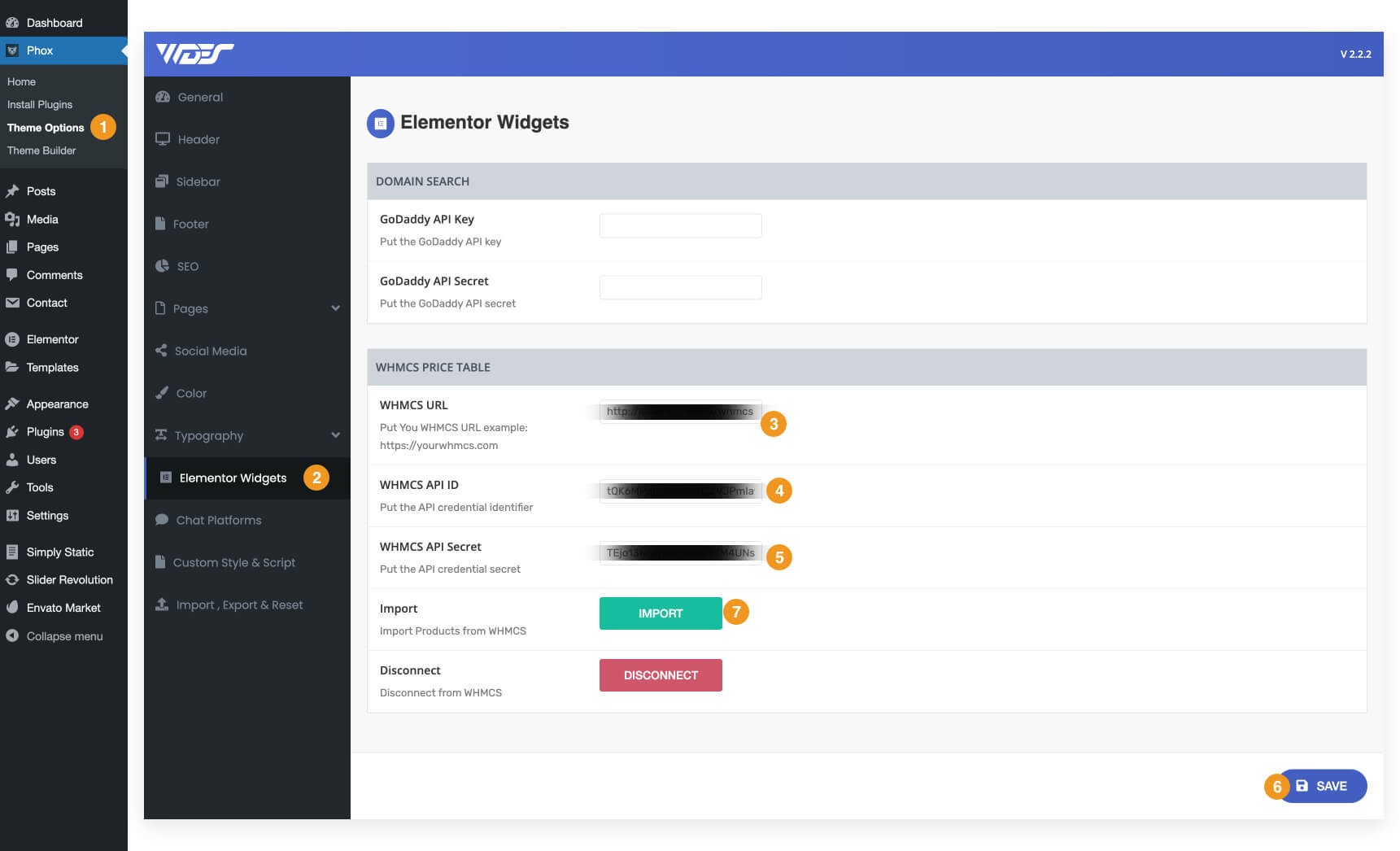
Use The Credentials in Phox Admin Panel
- Navigate to WordPress Admin > Phox > Theme Options > Elementor Widgets > WHMCS PRICE TABLE
- Fill the fields with the required data like your WHMCS URL, API ID, and API Secret, that you got from WHMCS.
- Click on the save button
- after the page reloads Click on the import button
🔔 Note :
If you do any changes to products in WHMCS you need first clear old import data by clicking on the Disconnect button to remove data and then reimport new data by clicking on the Import button.
In case you get this error after clicking import {“result”:”error”,”message”:”Invalid IP ::1″}
you will need to add your website IP Address in WHMCS “API IP Access Restriction“
Content
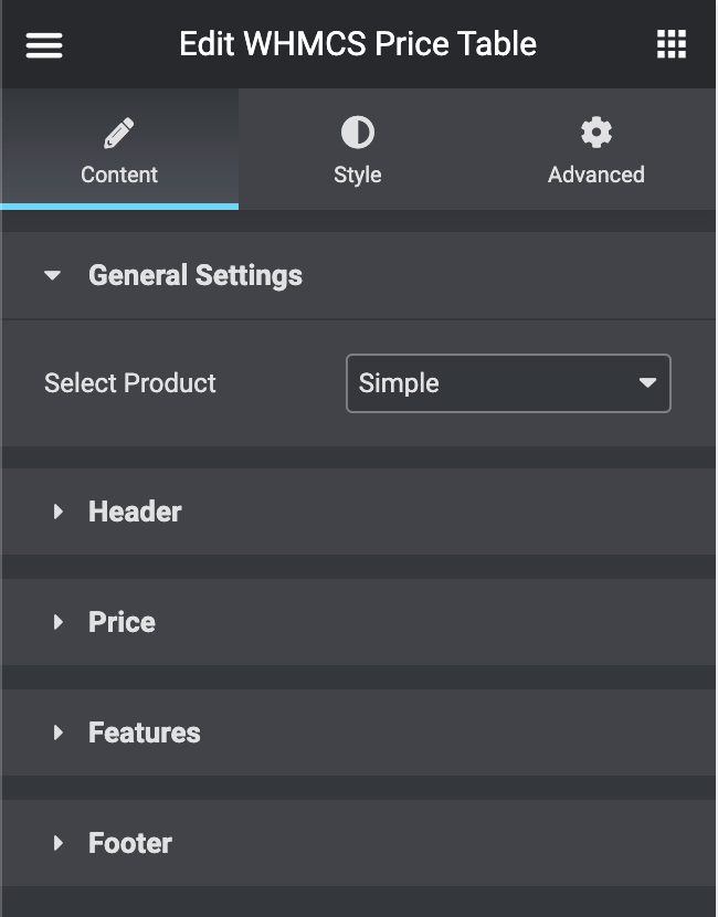
General Settings
- Select Product — here you can choose the product from the WHMCS products list.
Header
- Title — fill in the field with the Price Table widget title.
- Subtitle — here you should enter the subtitle for the price table.
- Above Title — here you have two options [icon, image] to use above the title.
- Icon — here you can select a suitable icon to use in the widget. Select one of the available icons from the dropdown list.
- Image — here you can select a suitable image to use in the widget.
- Strip — turn on the option if you need to apply an additionally featured badge, use a custom position of the featured badge, etc.
Price
- Currency — in this field, you need to choose the currency
- Billing Cycle — in this field, you need to choose the billing cycle
- Discount — turn on the option if you need to apply a discount and add the original price.
- Prefix — in this field you need to input the prefix for the price, usually, it is a currency symbol (you can as well leave the field empty if you don’t want to use any currency prefixes).
- Suffix — here you have to define the suffix for the price (usually it indicates the frequency of payment, e.g., “per month”, “per year”, etc.).
- Description — in this field, you need to define the price description.
Features
- Feature Header — here you can add a text header to the features area.
- Title — type in the feature title in this block.
- Text Decoration — choose between two options icon and image.
- Icon — here you can select a suitable icon to use in the widget. Select one of the available icons from the dropdown list.
- Image — here you can select a suitable image to use in the widget.
- Add Item — here you can add a new feature to be displayed in the price table.
Footer
- Text Before Button — here you can specify the text you want to show before the Order Button.
- Button Text — here you can input your custom Order button text (e.g., “purchase now”, “buy”, etc.).
- Link — in this field, you need to define the URL link that will redirect the customers to the purchase page or shopping cart.
- Text After Button — if you need to add the text below the Order button, just type it into this field.
Style
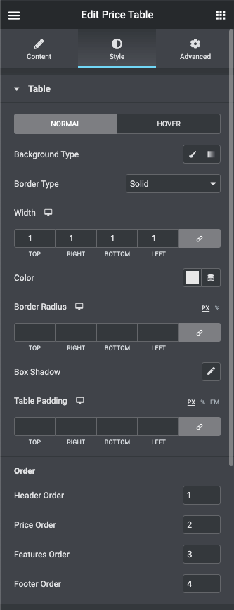
Table
Here you can customize the pricing table style.
- Background Type — in this block you can choose, whether you want to use classic or gradient type for the pricing table background. The customization options vary for each type.
- Classic Background Type
- Color — here you can set the background color for the animated box using the color picker tool.
- Image — here you can choose the image you want to use as a background. Select the image from the media library or upload it to define it as a background in this block. When the image is uploaded, you’ll be able to define its position and alignment, turn on repeat, and set the necessary size.
- Gradient Background Type
- Color — here you can set the background color for the widget using the color picker tool.
- Location — here you can define the proportion for the first color in the gradient background.
- Second Color — here you can set the second color to use in the gradient background.
- Location — here you can define the proportion for the second color in the gradient background.
- Type — define, if you want to use a linear or radial type of gradient.
- Angle — in this block you can set the angle for the gradient (in degrees).
- Border Type — here you can define the type of border you need to use for the element.
- Border Radius – here you can set the border-radius to make the angles more smooth and round.
- Box Shadow — enable this option if you want to access the shadow advanced settings for this widget, and need to apply shadow for it.
- Table Padding — here you can set the preferable custom padding. Fill in the values for the top, bottom, right, and left padding in pixels, %, or EM to apply your custom padding.
- Order — here you can reorder the price table blocks by changing the inputs number values in ascending order
Header
In this block you can apply custom colors and typography settings to the price table header.
- Background Color — here you can define the suitable color for the header background. Use a color picker tool to select the necessary color.
- Title — here you will find a bunch of options to control the title
- Title Color — here you can define the suitable color for the header title. Use a color picker tool to select the necessary color.
- Typography — turn the option on to view the typography settings. The typography settings are similar for Title, Subtitle, Pricing, Features, Footer Box, and Order Button blocks.
- Size — define the font size of the animated box title.
- Family — here you can set the font family for the title.
- Weight — in this block you can select a suitable font-weight.
- Transform — here you can choose from the dropdown menu if you want the title to be shown in uppercase, lowercase, capitalize, or normal way.
- Style — in this block you can choose from the dropdown menu the style for the font. It can be normal, italic (the characters look similar to handwriting), and oblique (the characters are slightly inclined to the right).
- Line Height — in this field you can set the height of the title line.
- Letter Spacing — here you can set the space between letters.
- Margin — input the values for the margins in the required fields.
- SubTitle — here you will find a bunch of options to control the sub Title
- SubTitle Color — here you can define the suitable color for the header subtitle. Use a color picker tool to select the necessary color.
- Typography — turn the option on to view the typography settings.
- Header Padding — here you can set the preferable custom padding. Fill in the values for the top, bottom, right, and left padding in pixels, %, or EM to apply your custom padding.
- Alignment — here you can define the preferable title alignment. The title can be placed to the left, to the right, or to remain centered.
- Border Type — here you can define the type of border you need to use for the element.
- Border Radius – here you can set the border-radius to make the angles more smooth and round.
Above Title
Here you can customize Above Title Options here depend on the used icon or image.
- Border Type — here you can define the type of the border you need to use for the element.
- Background Type — in this block you can choose, whether you want to use classic or gradient type for the pricing table background.
- Box Shadow – here you can apply the shadow for the icon or image and change the shadow’s settings, such as color, blur, spread, and position.
- in case you use an icon, you will find these options
- Icon Color — here you can set the icon color for the widget using the color picker tool.
- Font Size — in this block you can define the size of the icon digit (the maximum size is 500 px).
- Box Size — in this block you can define the size of the icon box (the maximum size is 100 px).
- Padding — here you can set the preferable custom padding. Fill in the values for the top, bottom, right, and left padding in pixels, %, or EM to apply your custom padding.
- Alignment — here you can define the preferable alignment. The element can be placed to the left, to the right, or to remain centered.
- in case you use an image, you will find these options
- Width — here you can set the image width in px or %.
- Max Width — here you can set the maximum image width in px or %.
- you will have two states normal, and hover, to apply Custom filters. and Hover Effects.
Pricing
In this block you can apply custom appearance settings to the pricing background, prefix, values and suffix typography and colors.
- Background Color — here you can select the color to use for the pricing general background.
- Prefix — here you will find a bunch of options to customize the prefix
- Price Prefix Color — here you can select the preferable color for the price prefix.
- Typography — turn the option on to view the typography settings.
- Prefix Display — here you can define if you want the prefix to be displayed inline, or as a separate block.
- Vertical Currency Position — here you can set the vertical position for the prefix.
- Discount — here you will find a bunch of options to customize the Discount
- Discount Color — here you can select the preferable color for the discount.
- Typography — turn the option on to view the typography settings.
- Price Value — here you will find a bunch of options to customize the Price
- Price Color — in this block you can define the color to use for the price.
- Typography — turn the option on to view the typography settings.
- Suffix — here you will find a bunch of options to customize the Suffix
- Price Suffix Color — here you need to specify the color of the price suffix.
- Typography — turn the option on to view the typography settings.
- Suffix Display — here you can define if you want the Suffix to be displayed inline, or as a separate block.
- Description — here you will find a bunch of options to customize the description
- Price Description Color — here you need to specify the color of the price Description.
- Typography — turn the option on to view the typography settings.
- Gap — here you can add an extra gap between the price and other blocks.
- Price Block Padding — here you can set the preferable custom padding.
- Border Type — here you can define the type of border you need to use for the element.
- Border Radius – here you can set the border-radius to make the angles more smooth and round.
- Alignment — here you can define the preferable alignment. The element can be placed to the left, to the right, or to remain centered.
Features
In this block you can customize price table features, such as the feature’s background color and alignment.
- Features Header — here you will find a bunch of options to control the Features Header
- Typography — turn the option on to view the typography settings.
- Color – here you can change the Features Header color to the one you want.
- Alignment — here you can define the preferable alignment. The element can be placed to the left, to the right, or to remain centered.
- Padding — here you can set the preferable custom padding.
- Feature Item — here you will find a bunch of options to control the Feature Header
- Background Color — here you can define the background color to use it in the background of the features.
- Features Block Padding — here you can set the preferable custom padding.
- Border Type — here you can define the type of border you need to use for the element.
- Border Radius – here you can set the border-radius to make the angles more smooth and round.
- Alignment — here you can define the preferable alignment. The element can be placed to the left, to the right, or to remain centered.
- Typography — turn the option on to view the typography settings.
- you will have two states normal, and hover, to apply customization.
- Typography — turn the option on to view the typography settings.
- Color — here you can define the color to use it in the text of the features.
- Text Indent — here you can customize the space between text and icon.
- Feature Icon — here you will find a bunch of options to control the Feature Icon
- Icon Size — here you can define the size of the features icons.
- Icon Color — here you can select the color you want to use for the features icons.
- Feature Image — here you will find a bunch of options to control the Feature Image
- Image Size — here you can define the size of the featured image.
- Features Divider — enable the option if you want to separate features using a divider to make them stand out.
- Divider Style — here you can select the style to use for the divider. It can be solid, double, dotted, or dashed, You can also define the weight, the width, and the gap for the divider using the corresponding controls.
Footer
In this block you can customize the Footer elements, such as the footer box background, typography, etc.
- Background Color — click on the option to define the suitable color for the Footer box background.
- Color — here you can set the color to use in the Footer Box.
- Typography — turn the option on to view the typography settings.
- Padding – here you can set the preferable custom padding.
- Margin – input the values for the margins in the required fields.
- Border Type — here you can define the type of the border you need to use for the element.
- Border Radius – here you can set the border-radius to make the angles more smooth and round.
- Alignment — here you can define the preferable footer box alignment. The content of the Footer Box can be placed to the left, to the right, or to remain centered.
- Order Button — here you will find a bunch of options to control the button style
- Size — you can choose the set the button full width or auto.
- Add Icon — you can enable this button to add a custom icon and customize it.
- You can switch from customizing Normal to Hover style settings. Just click on the button Hover to proceed to customizing hover elements.
- Background Type — here you can select a suitable background for the Order button.
- Text Color — use color picker tool to set the preferable color for the button text.
- Typography — turn the option on to view the typography settings.
- Padding – here you can set the preferable custom padding.
- Border Radius – here you can set the border-radius to make the angles more smooth and round.
- Border Type — here you can define the type of the border you need to use for the element.
- Box Shadow — enable this option if you want to access the shadow advanced settings for this widget, and need to apply shadow for it.
Stripe
- Background Color — click on the option to define the suitable color for the Stripe background.
- Text Color — here you can set the color to use in the Stripe.
- Typography — turn the option on to view the typography settings.
- Box Shadow — enable this option if you want to access the shadow advanced settings for this widget, and need to apply shadow for it.