 Last Update: August 14, 2022

The Portfolio widget will be helpful if you need to showcase your creative works. It’s perfect for displaying photos for photographers models, estate agents, designers, artists, architects, etc.
Portfolio Widget Sample

Content
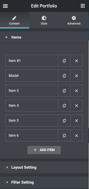
- Items
- item
- Title, Description: Define the title and the description. Depending on what Preset will be chosen in the Settings section this text will be shown over the picture on hover or under it;
- Image: Upload the picture to show in your portfolio.
- Category: This field helps you to categorize the images. The name of the category you type into this field will be displayed at the top of the portfolio. Once you click any category, the photos are filtered, and only the ones related to the selected category are shown;
- Link Text, Link URL: If you want to add a button to the portfolio item, you can add the text on the button and a link to these fields. The button will appear only when you add the link.
- Image Link: In this drop-down menu, you choose how the link will be opened – in the lightbox or on a separate page.
- item
- Layout Settings
- Layout type: This is the way the items will be placed in the grid. Masonry is a layout where all the pictures have the same width and their height is changed proportionally. In the Grid layout, all images have the same width and height. If you choose the Justify layout, the pictures will be unified by their height and the width will be changed proportionally. And the List will place all the images in a list, one under another;
- Layout Presets: In this drop-down menu, you choose where the content will be placed. In Image with Text Box on hover the title, description, and button overlay half of the picture on hover. In the Image with Text Below all the data is placed under the picture. If you choose Only Image only the zoom icon will be shown on the overlay. And in the Image with Full Text box when hovering the text information and the button overlays the whole picture on hover;
- Columns: In this drop-down, you can select the number of columns, from 1 to 6;
- Items Gap: You can change the gap between items with the help of the slider and by typing the value into the field;
- HTML Tag: Set the tag of the Title.
- Filter Settings
- Enable Filter: This option will allow you to show/hide Filter.
- “All” Filter Label: The categories you create in the items section are placed at the top of the portfolio and can be used to filter the items. There is also an All filter that shows all the items. In this field, you can rename it.
- Separator Icon: Change the separator icon between the categories list.
Style
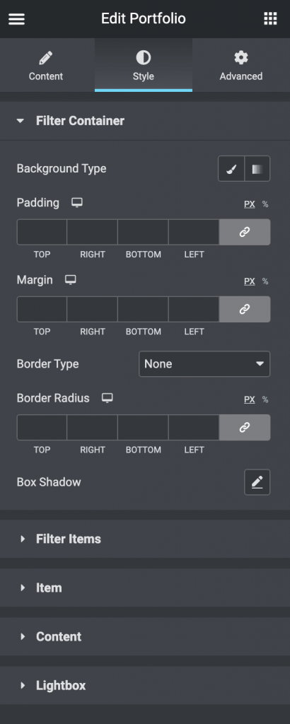
- Filter Container
- Background Type: Choose, whether you want to use classic or gradient type for the filter container. The customization options vary for each type.
- Padding: Set the preferable custom padding. Fill in the values for the top, bottom, right, and left padding in pixels or % to apply your custom padding.
- Margin: Define the margins
- Border Type: Select the needed type of border to use.
- Border Radius: Set the border radius to make the angles more smooth and round.
- Box Shadow: Apply the shadow and change the shadow’s settings, such as color, blur, spread, and position.
- Filter Items
- Alignment: Align the filter items to the left, right, or center.
- Separator Color: Choose the color of the separator.
- Separator Size: Choose the size of the separator.
- Padding: Set the preferable custom padding. Fill in the values for the top, bottom, right, and left padding in pixels or % to apply your custom padding.
- Margin: Define the margins
- Switch between Normal & Hover modes to customize the Filter Items.
- Color: Choose the color of the filter item.
- Typography: Change the typography options for the filter items
- Background Type: Choose, whether you want to use classic or gradient type for the filter container. The customization options vary for each type.
- Border: Select the needed type of border to use.
- Border Radius: Set the border-radius to make the angles more smooth and round.
- Box Shadow: Apply the shadow and change the shadow’s settings, such as color, blur, spread, and position.
- Item
- Padding: Set the preferable custom padding. Fill in the values for the top, bottom, right, and left padding in pixels or % to apply your custom padding.
- Border: Select the needed type of border to use.
- Border Radius: Set the border-radius to make the angles more smooth and round.
- Box Shadow: Apply the shadow and change the shadow’s settings, such as color, blur, spread, and position.
- Content
- Container
- Background Type: Choose, whether you want to use classic or gradient type for the content container. The customization options vary for each type.
- Padding: Set the preferable custom padding. Fill in the values for the top, bottom, right, and left padding in pixels or % to apply your custom padding.
- Margin: Define the margins
- Border: Select the needed type of border to use.
- Border Radius: Set the border-radius to make the angles more smooth and round.
- Box Shadow: Apply the shadow and change the shadow’s settings, such as color, blur, spread, and position.
- Image
- Border Radius: Set the border-radius to make the angles more smooth and round.
- Title
- Alignment: Align the Widget to the left, right, or center.
- Color: Choose the color of the title.
- Typography: Change the typography options for the title.
- Padding: Set the preferable custom padding. Fill in the values for the top, bottom, right, and left padding in pixels or % to apply your custom padding.
- Margin: Define the margins
- Category
- Alignment: Align the Widget to the left, right, or center.
- Color: Choose the color of the category.
- Typography: Change the typography options for the category.
- Padding: Set the preferable custom padding. Fill in the values for the top, bottom, right, and left padding in pixels or % to apply your custom padding.
- Margin: Define the margins
- Button
- Alignment: Align the Widget to the left, right, or center.
- Text Alignment: Choose the text alignment inside the button.
- Padding: Set the preferable custom padding. Fill in the values for the top, bottom, right, and left padding in pixels or % to apply your custom padding.
- Margin: Define the margins.
- Switch between Normal & Hover modes to customize the button.
- Text Color: Choose the color of the button.
- Background Color: Choose the button background color.
- Typography: Change the typography options for the button.
- Border: Select the needed type of border to use.
- Border Radius: Set the border-radius to make the angles more smooth and round.
- Box Shadow: Apply the shadow and change the shadow’s settings, such as color, blur, spread, and position.
- Order
- Title Order: Set the title order.
- Category Order: Set the category order.
- Description Order: Set the description order.
- Button Order: Set the button order.
- Container
- Lightbox
- Background Type: Choose whether you want to use classic or gradient type for the lightbox Header. The customization options vary for each type.