 Last Update: May 23, 2020

Posts Block List widget is a perfect tool for displaying your posts in the form of neat content blocks with an easily changeable layout and customizable appearance. You can change the listing max-width, featured post position, image size, style up post excerpts and meta information without ever touching a single line of code.
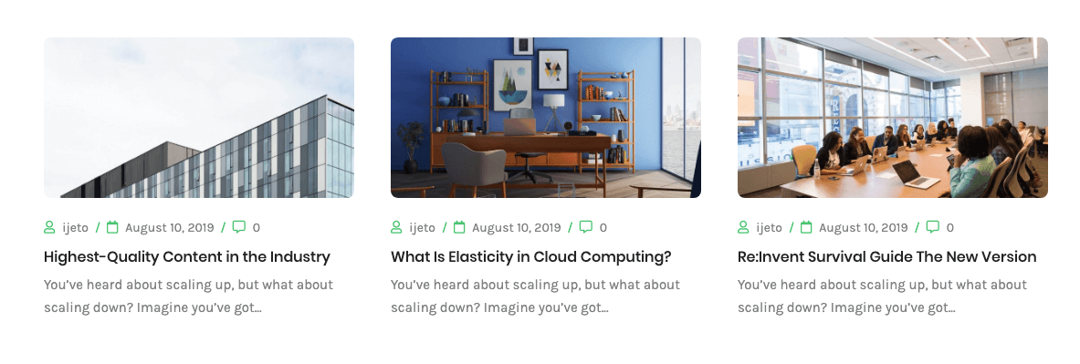
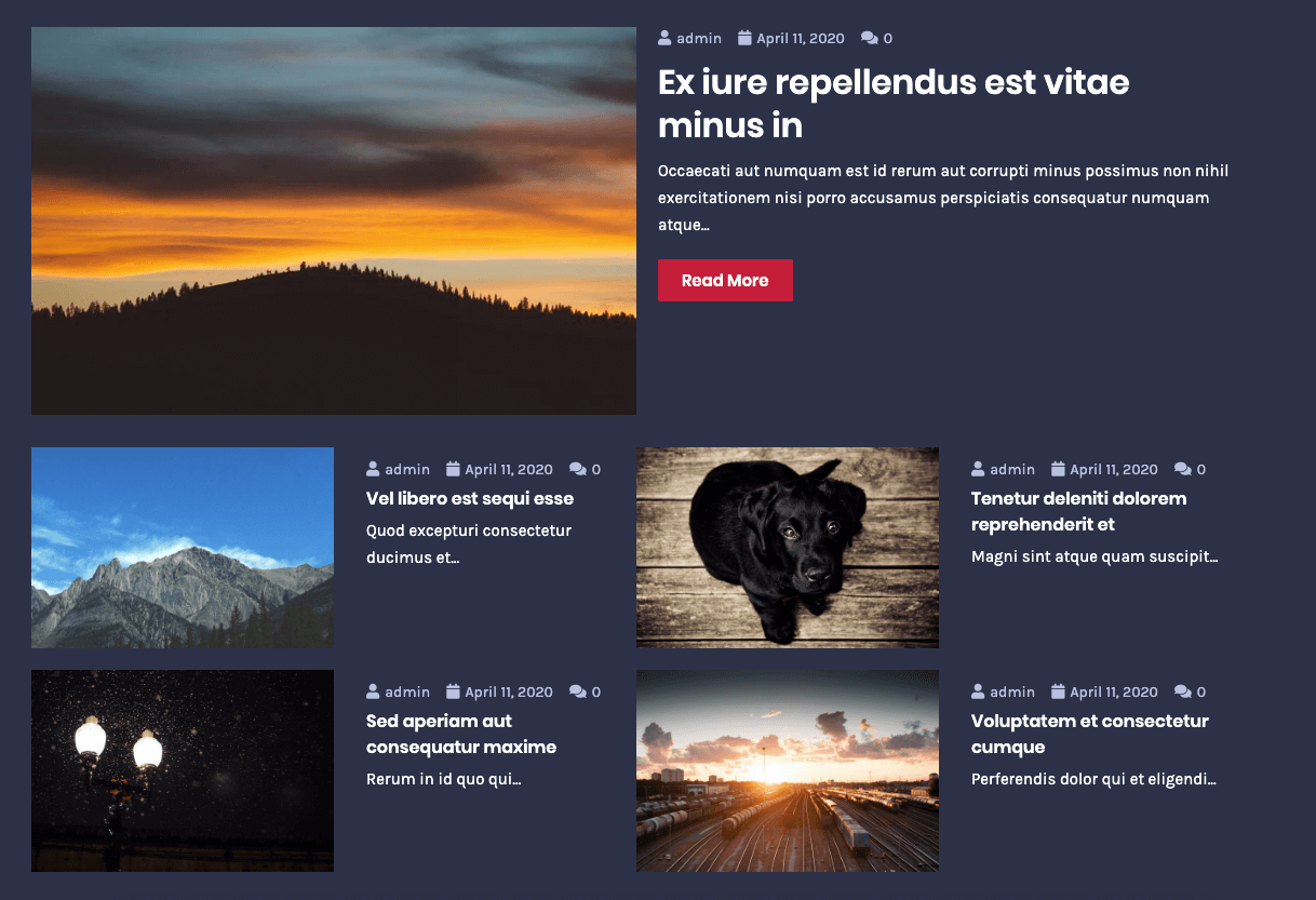
Posts Block List Widget Sample
On the picture below you can view Posts Block List widget sample.

Content
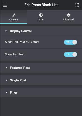
- Display Control – Here you will find the options to control show/hide the blocks.
- Mark First Post as Feature – enable this option in order to display the first post from the listing as a featured one. If the option is disabled, all the posts will be shown as equal listing items.
- Show List Post – enable this option to show the posts list.
- Featured Post – Here you will find the options to customize the featured post.
- Featured Post Position – if you’ve enabled Mark First Post as a Featured option, you’ll be able to select the featured post position (Top, Left, Right).
- Featured Post Max Width – use the controls or type in the needed value in px in the corresponding field to set the maximum featured post width.
- Featured Post Layout – here you can select if you want the featured post to display content in a Boxed style, or use the Simple style.
- Featured Post Image Size – here you can select the suitable size for the featured post image.
- Featured Post Title Length – here you can select the length of the post title to be displayed in the featured post.
- Featured Post Excerpt Length – here you can select the length of the post excerpt to be displayed in the featured post.
- Featured Excerpt Trimmed Ending – here you can define the appearance of the featured excerpt trimmed ending.
- Featured Post Read More Button – enable this option in order to show the Read More button.
- Read More Button Label – here you can specify the label for the Read More button.
- Read More Button Icon – here you can specify the icon for the Read More button.
- Featured Post Meta – enable this option in order to display the post meta information in the featured post.
- Featured Meta Position – choose the position of the featured post-meta-information (before or after the title or after excerpt).
- Show Post Author – enable this option in order to display the post author for the featured post.
- Author Icon – if the previous option is active, you can select the icon to display on the left of the post author’s username.
- Show Post Date – enable this option in order to display the date when the post is published.
- Date Icon – when the previous option is active, you can select the icon to display it on the left of the post publishing date.
- Show Post Comments – enable this option in order to display the number of comments to the post.
- Comments Icon – when the previous option is active, you can select the icon to display it on the left of the number of comments to the post.
- Show Post Terms – enable the option in order to display the post terms.
- Post Terms From – select the source of the terms (categories or tags or products,..).
- Single Post – Here you will find the options to customize the single post.
- Columns Number – select the number of columns for different screen resolutions to make the widget content responsive. You can set from 1 to 4 columns.
- Rows Number – here you can select how many rows you want to display in the listing. you can set from 1 to 6 rows.
- Post Thumbnail – enable this option to display the post thumbnail image.
- Post Image Size – here you can set the preferable image size for the posts displayed in the listing.
- Post Image Position – here you can set the needed post image position (Top, Left, Right).
- Post Image Max Width – use the controls or type in the needed value in pixels to define the maximum width for the post images.
- Title Length – type in the post title length value to set it for the posts shown in the listing.
- Excerpt Length – type in the post excerpt length value to set it for the posts shown in the listing.
- Excerpt Trimmed Ending – here you can define the appearance of the excerpt trimmed ending.
- Read More Button – enable this option in order to show the Read More button in posts.
- Read More Button Label – here you can specify the label for the Read More button in posts.
- Read More Button Icon – here you can specify the icon for the Read More button in posts.
- Post Meta – enable this option in order to display the post meta information.
- Meta Position – choose the position of the post-meta-information (before or after the title or after excerpt).
- Show Post Author – enable this option in order to display the post author for the posts shown in the listing.
- Author Icon – if the previous option is active, you can set the icon to display it on the left from the post author’s username.
- Show Post Date – enable this option if you need to display the date when the post is published.
- Date Icon – if the previous option is active, you can set the icon to display it on the left from the date when the post is published.
- Show Post Comments – enable this option in order to enable displaying the number of comments to the post.
- Comments Icon – in the case the previous option is active you can set the icon to display it on the left from the number of comments to the post.
- Show Post Terms – enable the option in order to display the post terms.
- Show Terms From – select the source of the terms (categories or tags or Formats).
- Filter – Here you will find the options to filter the posts
- Post Type – here you can select the post type you want to use (e.g., Posts, Pages, Projects).
- Filter Posts By – here you can select the filter type you want to use for this widget’s content (Categories, Tags, IDs, or All).
- Get posts from categories/tags/IDs – here you can select which post categories/tags/IDs you want to display using the Posts Block List widget.
- Exclude Posts by IDs – here you can specify the post IDs you want to exclude from showing up.
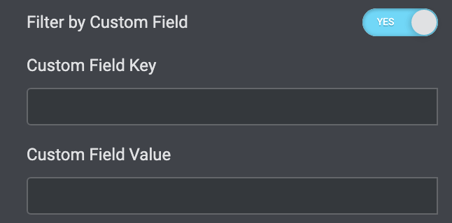
- Filter by Custom Field – enable this option to be able to filter the posts by custom field or even custom field value.
- Custom Field Key – input the custom field key for the posts to show only those which have this custom field.
- Custom Field Value – here you can specify the value by which the posts will be sorted and shown (e.g., key: color, value: red).
- Order By – here you can reorder the posts according to different criteria like Date, Menu Order, Title, ID, Random, Comment, Date Modified, and Author.
- Order – reorder the posts in ascending or descending order.
Style
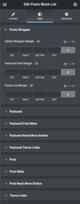
- Posts Wrapper – here you will find a bunch of options to control posts spacing
- Global Wrapper Margin – here you can input the margin of the posts wrapper.
- Featured Post Margin – here you can input the wrapper margin for the Featured post.
- Posts List Margin – here you can input the margin of the posts list.
- Featured – here you will find a bunch of options to control Featured Post
- Padding – here you can set the preferable custom padding for the featured box element with content and overlay. Fill in the values for the top, bottom, right, and left padding in pixels, %, or EM to apply your custom padding.
- Item Content Margin – here you can apply your custom margins for the whole featured post block.
- Background Type – in this block you can choose, whether you want to use classic or gradient type for the featured post.
- Border Type – here you can define the needed border type for the featured post. It can be dotted, dashed, double, or solid.
- Border Radius – here you can define the values for the radius of the selected border.
- Box Shadow – enable this option if you want to access the shadow advanced settings for the featured post and need to apply shadow for it.
- Post Image – here you will find a bunch of options to control Post Image
- Border Radius – here you can define the values for the radius of the post image.
- You can customize the appearance of the post image overlay using the Normal or Hover mode. Just switch between the modes using the corresponding buttons.
- Background Type – in this block you can choose, whether you want to use classic or gradient type for the post image overlay.
- Post Title – here you will find a bunch of options to control Post Title
- Color – here you can set the color for the post title text using color picker tool.
- Color Hover – here you can set the Hover color for the post title text using color picker tool.
- Typography – turn the option on to view the typography settings.
- Text Decoration Hover – here you can apply the underline for the button text.
- Margin – here you can apply your custom margins for the post title.
- Alignment – Align the heading to the left, right, center, or justified
- Post Text – here you will find a bunch of options to control Post Text
- Color – here you can select the preferable color for the post text using color picker tool.
- Typography – turn the option on to view the typography settings.
- Margin – here you can apply your custom margins for the post text.
- Alignment – Align the heading to the left, right, center, or justified
- Featured Post Meta & Post Meta – here you will find a bunch of option to control Post Meta
- Meta Icon Size – use the controls to change the icon size or type in the size value in px in the corresponding field.
- Meta Icon Gap – here you can set the gap distance between the icon and the meta-information text.
- Background Color – here you can set the background color for the post meta using color picker tool.
- Text Color – here you can set the color for the post text using color picker tool.
- Links Color – here you can set the color for the post links using color picker tool.
- Links Hover Color – here you can set the color for the post links on hover using color picker tool.
- Typography – turn the option on to view the typography settings.
- Padding – here you can set the preferable custom padding for the post meta. Fill in the values for the top, bottom, right, and left padding in pixels to apply your custom padding.
- Margin – here you can apply your custom margins for the post meta.
- Alignment – here you can define the preferable post meta information alignment. It can be placed to the left, to the right, or to remain centered.
- Meta Divider – here you can input the custom divider text or symbol.
- Divider Gap – here you can set the gap distance between the divider and the meta-information text.
- Featured Read More Button & Post Read More Button – here you will find a bunch of option to control Read More Button
- You can customize the appearance of the button using the Normal or Hover mode. Just switch between the modes using the corresponding buttons.
- Background Type – in this block you can choose, whether you want to use classic or gradient type for the button.
- Text Color – here you can set the color for the button using color picker tool.
- Typography – turn the option on to view the typography settings.
- Text Decoration Hover – here you can apply the underline for the button text.
- Padding – here you can set the preferable custom padding for the button. Fill in the values for the top, bottom, right, and left padding in pixels to apply your custom padding.
- Border Radius – here you can define the values for the radius of the button.
- Border Type – here you can define the needed border type for the button. It can be dotted, dashed, double, or solid.
- Box Shadow – enable this option if you want to access the shadow advanced settings for the button and need to apply shadow for it.
- Alignment – here you can define the preferable button alignment. It can be placed to the left, to the right, or to remain centered.
- Featured Terms Link & Post Terms Link – here you will find a bunch of option to control Terms Link
- Padding – here you can set the preferable custom padding for the Terms Link. Fill in the values for the top, bottom, right, and left padding in pixels to apply your custom padding.
- You can customize the appearance of the Terms Link using the Normal or Hover mode. Just switch between the modes using the corresponding buttons.
- Background Color – in this block you can choose the color of the Terms Link
- Text Color – here you can set the color for the Terms Link using color picker tool.
- Typography – turn the option on to view the typography settings.
- Text Decoration – here you can apply the underline for the Terms Link.
- Border Radius – here you can define the values for the radius of the Terms Link.
- Border Type – here you can define the needed border type for the Terms Link. It can be dotted, dashed, double, or solid.
- Box Shadow – enable this option if you want to access the shadow advanced settings for the Terms Link and need to apply shadow for it.
- Margin – here you can apply your custom margins for the terms link.
- Post – here you will find a bunch of option to control Post
- Padding – here you can set the preferable custom padding for the post. Fill in the values for the top, bottom, right, and left padding in pixels to apply your custom padding.
- Margin – here you can apply your custom margins for the post.
- Item Content Margin – here you can apply your custom margins for the post. content
- Background Type – in this block you can choose, whether you want to use classic or gradient type for the post. The customization options vary for each type.
- Border Type – here you can define the needed border type for the post. It can be dotted, dashed, double, or solid.
- Border Radius – here you can define the values for the radius of the selected border.
- Box Shadow – enable this option if you want to access the shadow advanced settings for the posts, and need to apply shadow for them.
- Post Image – here you will find a bunch of options to control Post Image
- Border Radius – here you can define the values for the radius of the post image.
- You can customize the appearance of the post image overlay using the Normal or Hover mode. Just switch between the modes using the corresponding buttons.
- Background Type – in this block you can choose, whether you want to use classic or gradient type for the post image overlay.
- Post Title – here you will find a bunch of options to control Post Title
- Color – here you can set the color for the post title text using color picker tool.
- Color Hover – here you can set the Hover color for the post title text using color picker tool.
- Typography – turn the option on to view the typography settings.
- Text Decoration Hover – here you can apply the underline for the button text.
- Margin – here you can apply your custom margins for the post title.
- Alignment – Align the heading to the left, right, center, or justified
- Post Text – here you will find a bunch of options to control Post Text
- Color – here you can select the preferable color for the post text using color picker tool.
- Typography – turn the option on to view the typography settings.
- Margin – here you can apply your custom margins for the post text.
- Alignment – Align the heading to the left, right, center, or justified
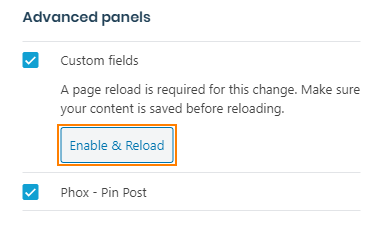
Adding Custom Meta Field
- First, let’s access WordPress Dashboard and here navigate to Posts > All Posts. Select one of the posts and click Edit in order to add a custom meta field to it.
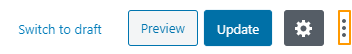
- After that open the 3 Dots located in the top right corner.
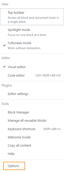
- it will open list, chooses Options .
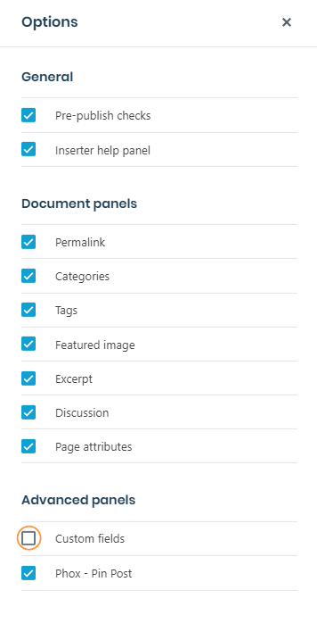
- check Custom Fields option .
- After check it you must click on Enable & Reload button .
- Scroll the page down to see the Custom Fields block .

- Click on Enter new to enter new key and value.
- after finish click on Add custom Filed to save your new data.
You can use custom fields on widget now with your data that add it .