 Last Update: August 20, 2021

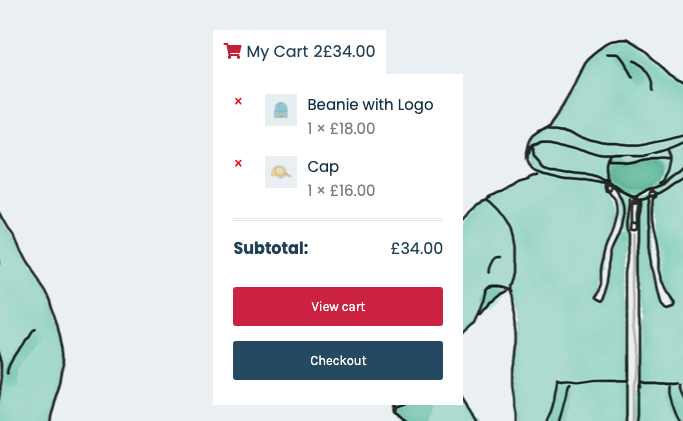
The Site Woo Cart widget is a useful tool for any online store that makes it easy to show the number of the chosen items and their total price. It can be very convenient for the user to continue viewing the goods on the site and have a constant look at the total price.
Site Woo Cart Widget Sample
Content
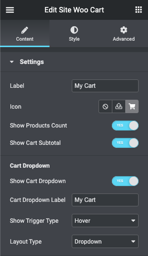
- Label: This is the title of the shopping cart that will be visible to users.
- Icon: If you want to add the icon to the label, you can choose it from the Icon Library or upload a custom SVG file.
- Show Products Count: If you enable this toggle, the user will see the number of items he/she added to the cart.
- Show Cart Subtotal: Turn this toggle on if you want to show the total price of all added items to the user.
- Cart Dropdown
- Show Cart Dropdown: If you want to give the user an opportunity to see all the items added to the cart in the drop-down list, enable this toggle.
- Cart Dropdown Label: Type the text that will be placed on the top of the cart list here.
- Show Trigger Type: The drop-down list can appear on Hover or after a Click on the cart.
- Layout Type: The list of items can appear as a Dropdown or Slide Out from the right side of the screen.
Style
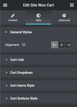
- General Styles
- Alignment: align the cart [left – right – center].
- Cart Link
- Typography: turn the option on to view the typography settings.
- Normal – Hover: you can switch between the modes for the following options:
- Background Color: set the background color for the cart.
- Label Color: set the text color for the label.
- Icon Color: set the text color for the icon.
- Count Background Color: set the background color for the count.
- Count Color: set the text color for the count.
- Totals Color: set the text color for the totals.
- Padding: here you can set the preferable custom padding. Fill in the values for the top, bottom, right, and left padding in pixels or % to apply your custom padding.
- Border: here you can select the needed type of border to use for the cart.
- Border Radius: here you can set the border-radius to make the angles more smooth and round.
- Icon
- Icon Size: set the icon size.
- Gap After Icon: add space after the icon.
- Label
- Label Font Size: set the label font size.
- Gap After Label: add space after the label.
- Count
- Count Font Size: set the count icon size.
- Count Box Size: set the count box size.
- Margin: specify the margin for the count.
- Border Radius: here you can set the border-radius to make the angles more smooth and round.
- Totals
- Totals Font Size: set the total font size.
- Cart Dropdown
- Container Styles
- Width (px): set the dropdown width in pixels.
- Background Color: set the background color for the dropdown.
- Padding: here you can set the preferable custom padding. Fill in the values for the top, bottom, right, and left padding in pixels or % to apply your custom padding.
- Border: here you can select the needed type of border to use for the dropdown.
- Border Radius: here you can set the border-radius to make the angles more smooth and round.
- Box Shadow: here you can apply the shadow for the dropdown and change the shadow’s settings, such as color, blur, spread, and position.
- Horizontal Position by: set the position of the dropdown (left-right).
- Left Indent: set the left indentation of the dropdown.
- Right Indent: set the right indentation of the dropdown.
- Dropdown Label Styles
- Typography: turn the option on to view the typography settings.
- Margin: specify the margin for the dropdown label.
- Padding: here you can set the preferable custom padding. Fill in the values for the top, bottom, right, and left padding in pixels or % to apply your custom padding.
- Border: here you can select the needed type of border to use for the dropdown label.
- Alignment: align the dropdown label [left – right – center].
- Dropdown Empty Message Styles
- Typography: turn the option on to view the typography settings.
- Margin: specify the margin for the dropdown empty message.
- Padding: here you can set the preferable custom padding. Fill in the values for the top, bottom, right, and left padding in pixels or % to apply your custom padding.
- Alignment: align the dropdown empty message [left – right – center].
- Container Styles
- Cart Items Style
- Product List Style
- Max Height: set the maximum Height for the Product list in pixels.
- Margin: specify the margin for the product list.
- Padding: here you can set the preferable custom padding. Fill in the values for the top, bottom, right, and left padding in pixels or % to apply your custom padding.
- Border: here you can select the needed type of border to use for the product list.
- Product Item Style
- Margin: specify the margin for the product item.
- Padding: here you can set the preferable custom padding. Fill in the values for the top, bottom, right, and left padding in pixels or % to apply your custom padding.
- Divider: turn it on to customize the divider between the product items.
- Product Image Style
- Width (px): set the product image width in pixels.
- Margin: specify the margin for the product image.
- Product Title Styles
- Typography: turn the option on to view the typography settings.
- Color: set the text color for the product title.
- Hover Color: set the text hover color for the product title.
- Product Remove Button Styles
- Color: set the text color for the product remove button.
- Hover Color: set the text hover color for the product remove button.
- Product Quantity Styles
- Typography: turn the option on to view the typography settings.
- Color: set the text color for the product quantity.
- Product Amount Styles
- Typography: turn the option on to view the typography settings.
- Color: set the text color for the product amount.
- Total Container Styles
- Margin: specify the margin for the total Container.
- Padding: here you can set the preferable custom padding. Fill in the values for the top, bottom, right, and left padding in pixels or % to apply your custom padding.
- Border: here you can select the needed type of border to use for the total container.
- Alignment: align the total container [left – right – center].
- Total Title Styles
- Typography: turn the option on to view the typography settings.
- Color: set the text color for the total title.
- Total Amount Styles
- Typography: turn the option on to view the typography settings.
- Color: set the text color for the total amount.
- Product List Style
- Cart Buttons Style
- Buttons Container Styles
- Margin: specify the margin for the button Container.
- Padding: here you can set the preferable custom padding. Fill in the values for the top, bottom, right, and left padding in pixels or % to apply your custom padding.
- Border: here you can select the needed type of border to use for the button container.
- View Cart Button Styles
- Typography: turn the option on to view the typography settings.
- Normal – Hover: you can switch between the modes for the following options:
- Background Color: set the background color for the view cart button.
- Text Color: set the text color for the view cart button.
- Border: here you can select the needed type of border to use for the view cart button.
- Border Radius: here you can set the border-radius to make the angles more smooth and round.
- Box Shadow: here you can apply the shadow for the dropdown and change the shadow’s settings, such as color, blur, spread, and position.
- Padding: here you can set the preferable custom padding. Fill in the values for the top, bottom, right, and left padding in pixels or % to apply your custom padding.
- Margin: specify the margin for the view cart button.
- Checkout Button Styles
- Typography: turn the option on to view the typography settings.
- Normal – Hover: you can switch between the modes for the following options:
- Background Color: set the background color for the checkout button.
- Text Color: set the text color for the checkout button.
- Border: here you can select the needed type of border to use for the checkout button.
- Border Radius: here you can set the border-radius to make the angles more smooth and round.
- Box Shadow: here you can apply the shadow for the checkout button and change the shadow’s settings, such as color, blur, spread, and position.
- Padding: here you can set the preferable custom padding. Fill in the values for the top, bottom, right, and left padding in pixels or % to apply your custom padding.
- Margin: specify the margin for the checkout button.
- Buttons Container Styles