 Last Update: August 21, 2022

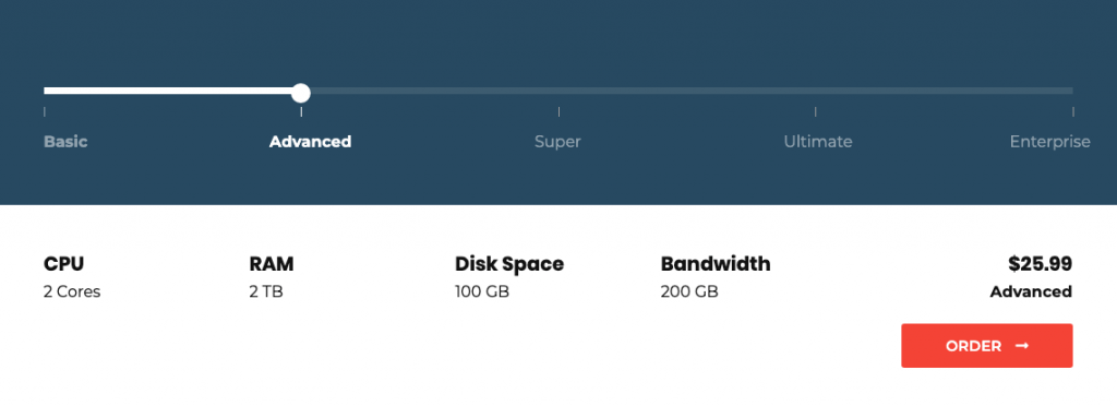
The range slider widget will be helpful if you need to showcase your website services prices and how they will grow.
Range Slider Sample
Content
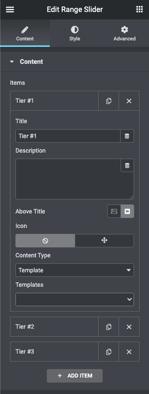
- Items
- Tier
- Title, Description: Define the title and the description for the tier.
- Above Title: Choose between icon and image for the tier.
- Content Type: Choose between default Editor or set a custom Elementor template.
- Tier
Style
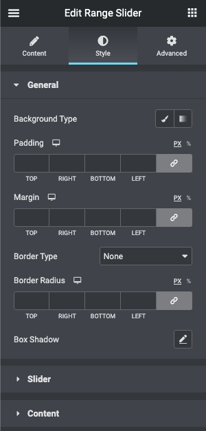
- General
- Background Type: Choose, whether you want to use classic or gradient type for the range slider. The customization options vary for each type.
- Padding: Set the preferable custom padding. Fill in the values for the top, bottom, right, and left padding in pixels or % to apply your custom padding.
- Margin: Define the margins.
- Border Type: Select the needed type of border to use.
- Border Radius: Set the border radius to make the angles more smooth and round.
- Box Shadow: Apply the shadow and change the shadow’s settings, such as color, blur, spread, and position.
- Slider
- Bar
- Background Type: Choose, whether you want to use classic or gradient type for the bar. The customization options vary for each type.
- Height: Set the height for the slider bar
- Border Type: Select the needed type of border to use.
- Border Radius: Set the border radius to make the angles more smooth and round.
- Box Shadow: Apply the shadow and change the shadow’s settings, such as color, blur, spread, and position.
- Margin: Define the margins.
- Active bar
- Background Color: Choose the active bar background color.
- Border Radius: Set the border radius to make the angles more smooth and round.
- Handler
- Background Type: Choose, whether you want to use classic or gradient type for the handler. The customization options vary for each type.
- Height: Set the height for the handler.
- Width: Set the width for the handler.
- Border Type: Select the needed type of border to use.
- Border Radius: Set the border radius to make the angles more smooth and round.
- Box Shadow: Apply the shadow and change the shadow’s settings, such as color, blur, spread, and position.
- Y position: Set the vertical position for the handler.
- X position: Set the horizontal position for the handler.
- Label
- Width: Set the width for the label
- Alignment: Align the label to the left, right, or center.
- Margin: Define the margins.
- Switch between Normal, Hover & Active modes to customize the label content.
- Title
- Typography: Change the typography options for the title.
- Color: Choose the color of the title.
- Margin: Define the margins
- Description
- Typography: Change the typography options for the title.
- Color: Choose the color of the title.
- Margin: Define the margins
- Image
- Height: Set the height for the image.
- Width: Set the width for the image.
- Icon
- Icon Size: Set the font size for the icon.
- color: Set the color for the icon.
- Title
- Bar
- Content
- Background Type: Choose, whether you want to use classic or gradient type for the content. The customization options vary for each type.
- Typography: Change the typography options for the content.
- Color: Set the color for the content.
- Padding: Set the preferable custom padding. Fill in the values for the top, bottom, right, and left padding in pixels or % to apply your custom padding.
- Border Type: Select the needed type of border to use.
- Border Radius: Set the border radius to make the angles more smooth and round.
- Box Shadow: Apply the shadow and change the shadow’s settings, such as color, blur, spread, and position.