 Last Update: August 20, 2021

The site Search widget is a control element. It is used to help the user to search and retrieve information from the database.
Site Search Widget Sample

Content
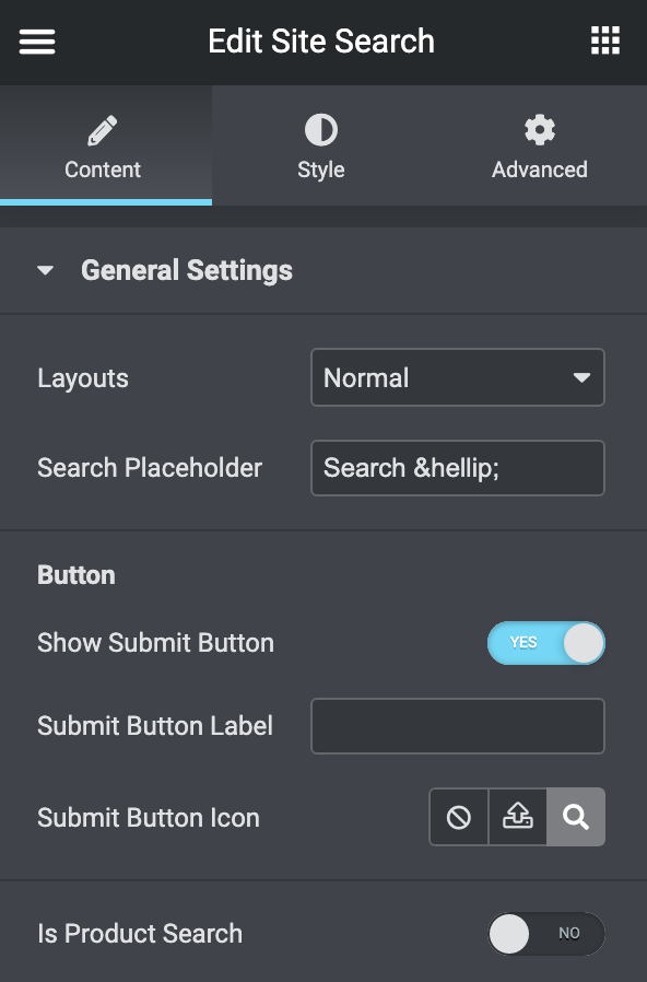
- General Settings
- Layouts: choose the layout for the search box (Normal, Popup).
- Search Placeholder: set the search input placeholder text.
- Button:
- Show Submit button: Turn it off to hide the submit button, in this case, you write then hit enter.
- Submit button label: You can add a text inside the submit button.
- Submit button icon: You can change the icon, upload a custom one, or delete it completely.
- Is Product Search: Switch it on in case that you use WooCommerce, and you need to search for the products.
- Popup Settings: in case that you choose popup layout
- Full Screen Popup: turn it on to show the search box on full-screen mode.
- Popup Trigger Icon: You can change the icon, upload a custom one, or delete it completely.
- Pop Close Button Icon: You can change the icon, upload a custom one, or delete it completely.
- Show Effect: you can choose from different animation effects or disable them.
Style
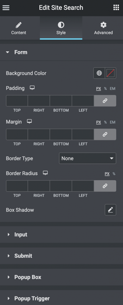
- Form
- Background Color: set the background color for the search form.
- Padding: here you can set the preferable custom padding. Fill in the values for the top, bottom, right, and left padding in pixels or % to apply your custom padding.
- Margin: specify the margin for the search form.
- Border: here you can select the needed type of border to use for the search form.
- Border Radius: here you can set the border-radius to make the angles more smooth and round.
- Box Shadow: here you can apply the shadow for the search form and change the shadow’s settings, such as color, blur, spread, and position.
- Input
- Typography: turn the option on to view the typography settings.
- Normal – Focus: you can switch between the modes for the following options:
- Background Color: set the background color for the input.
- Text Color: set the text color for the input.
- Placeholder Color: set the placeholder text color for the input.
- Box Shadow: here you can apply the shadow for the input and change the shadow’s settings, such as color, blur, spread, and position.
- Padding: here you can set the preferable custom padding. Fill in the values for the top, bottom, right, and left padding in pixels or % to apply your custom padding.
- Margin: specify the margin for the input.
- Border: here you can select the needed type of border to use for the input.
- Border Radius: here you can set the border-radius to make the angles more smooth and round.
- Submit
- Typography: turn the option on to view the typography settings.
- Icon Size: set the submit button icon size.
- Normal – Hover: you can switch between the modes for the following options:
- Background Color: set the background color for the submit button.
- Text Color: set the text color for the submit button.
- Padding: here you can set the preferable custom padding. Fill in the values for the top, bottom, right, and left padding in pixels or % to apply your custom padding.
- Margin: specify the margin for the submit button.
- Border: here you can select the needed type of border to use for the submit button.
- Border Radius: here you can set the border-radius to make the angles more smooth and round.
- Box Shadow: here you can apply the shadow for the submit button and change the shadow’s settings, such as color, blur, spread, and position.
- Popup Box
- Popup Content Width: set the popup box width in PX or %.
- Background Color: set the background color for the popup box.
- Padding: here you can set the preferable custom padding. Fill in the values for the top, bottom, right, and left padding in pixels or % to apply your custom padding.
- Margin: specify the margin for the popup box.
- Border: here you can select the needed type of border to use for the popup box.
- Border Radius: here you can set the border-radius to make the angles more smooth and round.
- Box Shadow: here you can apply the shadow for the popup box and change the shadow’s settings, such as color, blur, spread, and position.
- Popup Position
- Vertical Position by: choose Top or Bottom to set the position.
- Top Indent: set the top or bottom indent for the popup.
- Horizontal Position by: choose left or right to set the position.
- Left Indent: set the left or right indent for the popup.
- Popup Trigger
- Icon Size: set the popup trigger button icon size.
- Normal – Hover: you can switch between the modes for the following options:
- Background Color: set the background color for the popup trigger button.
- Text Color: set the text color for the popup trigger button.
- Alignment: align the popup trigger button [left – right – center].
- Padding: here you can set the preferable custom padding. Fill in the values for the top, bottom, right, and left padding in pixels or % to apply your custom padding.
- Margin: specify the margin for the popup trigger button.
- Border: here you can select the needed type of border to use for the popup trigger button.
- Border Radius: here you can set the border-radius to make the angles more smooth and round.
- Box Shadow: here you can apply the shadow for the popup trigger button and change the shadow’s settings, such as color, blur, spread, and position.
- Popup Close
- Icon Size: set the popup close button icon size.
- Normal – Hover: you can switch between the modes for the following options:
- Background Color: set the background color for the popup close button.
- Text Color: set the text color for the popup close button.
- Padding: here you can set the preferable custom padding. Fill in the values for the top, bottom, right, and left padding in pixels or % to apply your custom padding.
- Margin: specify the margin for the popup close button.
- Border: here you can select the needed type of border to use for the popup close button.
- Border Radius: here you can set the border-radius to make the angles more smooth and round.
- Box Shadow: here you can apply the shadow for the popup close button and change the shadow’s settings, such as color, blur, spread, and position.