 Last Update: May 23, 2020

Tabs widget is quite useful when creating tabs and enriching them with all kinds of Elementor-built content. It makes possible to organize content in a smart way and make it look way more stylish.
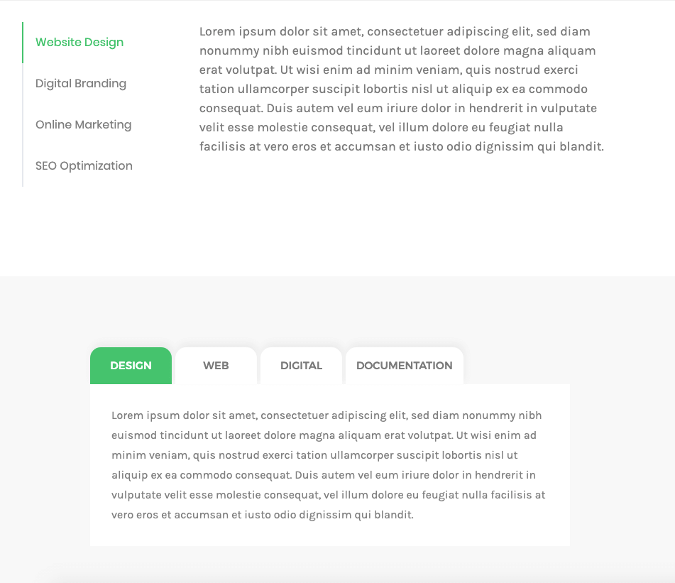
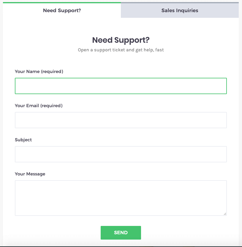
Tabs widget Sample
On the pictures below you can view Tabs widget sample.
Content
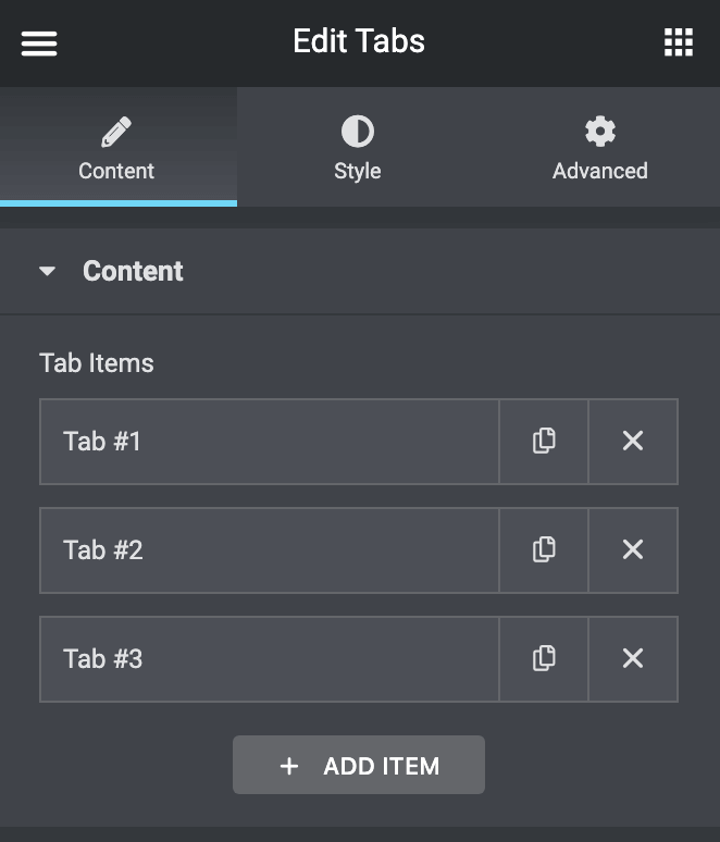
Tab Items
- Title – type in item Title to apply it.
- Description – type in item Description to apply it.
- Text Decoration – you will have 2 options, one to use Icon beside Tab Title, and the other one to use Image beside Tab Title.
- Icon – here you can select the icon to apply it to the tab.
- Image – here you can select the image to apply it to the tab.
- Content-Type – here you can select to use Editor, for example, write some texts, or you can choose Elementor Template you set before.
- Editor – here you can type your text and apply it to tab content.
- Template – here you need to choose the template to embed it inside the tab. and you will have options to customize tab animation like effect, delay, and speed.
- Add Item – click Add Item button to add more tabs to the widget.
Style

General Tab
- Tabs Position – here you can change the tabs position to top, bottom, left, or right.
- incase you choose left or right you will get new option Tabs Control Width to set the width
- Background Type – in this block you can choose, whether you want to use classic or gradient type for the items. The customization options vary for each type.
- Padding – here you can set the preferable custom padding. Fill in the values for the top, bottom, right, and left padding in pixels or % to apply your custom padding.
- Margin – input the values for the margins in the required fields.
- Border Type – here you can select the needed type of the border to use for the item.
- Border Radius – here you can set the border-radius to make the angles more smooth and round.
- Box Shadow – here you can apply the shadow for the widget and change the shadow’s settings, such as color, blur, spread, and position.
Tabs Control
- Background Type – in this block you can choose, whether you want to use classic or gradient type for the items. The customization options vary for each type.
- Padding – here you can set the preferable custom padding. Fill in the values for the top, bottom, right, and left padding in pixels or % to apply your custom padding.
- Margin – input the values for the margins in the required fields.
- Border Type – here you can select the needed type of the border to use for the item.
- Border Radius – here you can set the border-radius to make the angles more smooth and round.
- Box Shadow – here you can apply the shadow for the widget and change the shadow’s settings, such as color, blur, spread, and position.
Tabs Control Item
- Tabs Alignment – here you can set the alignment of the tabs and make it different for different screen resolutions.
- Icon Margin – input the values for the margins in the required fields.
- Image Margin – input the values for the margins in the required fields.
- Image Width – input the values for the width in the required fields.
- Icon Position – here you can choose between left and top icon position.
- Image Position – here you can choose between left and top image position.
Style State
Switch between Normal, Hover or Active modes to customize the controls text and icon according to your needs when the tab is active, or in the normal state.
- Text Color – here you can change the tab label text color to the one you want.
- Typography – turn the option on to view the typography settings.
- Icon Color – here you can change the color of the icons to be shown in the tabs.
- Icon Size – here you need to customize the size of the icons and make it responsive.
- Description – here you will find a bunch of option to customize Tabs Button Description
- Typography – turn the option on to view the typography settings.
- Description Color – here you can change the tab Description text color to the one you want.
- Padding – here you can set the preferable custom padding. Fill in the values for the top, bottom, right, and left padding in pixels or % to apply your custom padding.
- Margin – input the values for the margins in the required fields.
- Background Type – in this block you can choose, whether you want to use classic or gradient type for the tabs. The customization options vary for each type.
- Padding – here you can set the preferable custom padding. Fill in the values for the top, bottom, right, and left padding in pixels to apply your custom padding.
- Margin – input the values for the margins in the required fields.
- Border Radius – here you can set the border-radius to make the angles more smooth and round.
- Border Type – here you can select the needed type of the border to use for the item.
- Box Shadow – here you can apply the shadow for the tab and change the shadow’s settings, such as color, blur, spread, and position.
Tabs Content
incase you choose in > General Tab > Tabs Position [left or right] you will get here new option “Control Width” to set width for the content.
- Background Type – in this block you can choose, whether you want to use classic or gradient type for the content of the tabs. The customization options vary for each type.
- Typography – turn the option on to view the typography settings.
- Color – here you can change the tab Content text color to the one you want.
- Padding – here you can set the preferable custom padding. Fill in the values for the top, bottom, right, and left padding in pixels to apply your custom padding.
- Border Type – here you can select the needed type of the border to use for the item content.
- Border Radius – here you can set the border-radius to make the angles more smooth and round.
- Box Shadow – here you can apply the shadow for the tab content and change the shadow’s settings, such as color, blur, spread, and position.