 Last Update: May 23, 2020

Dual Button widget will assist you in creating buttons with your custom text and links, eye-catching icons, and versatile hover effects! With this widget, you can easily add a button whenever you need it and style it up according to your vision!
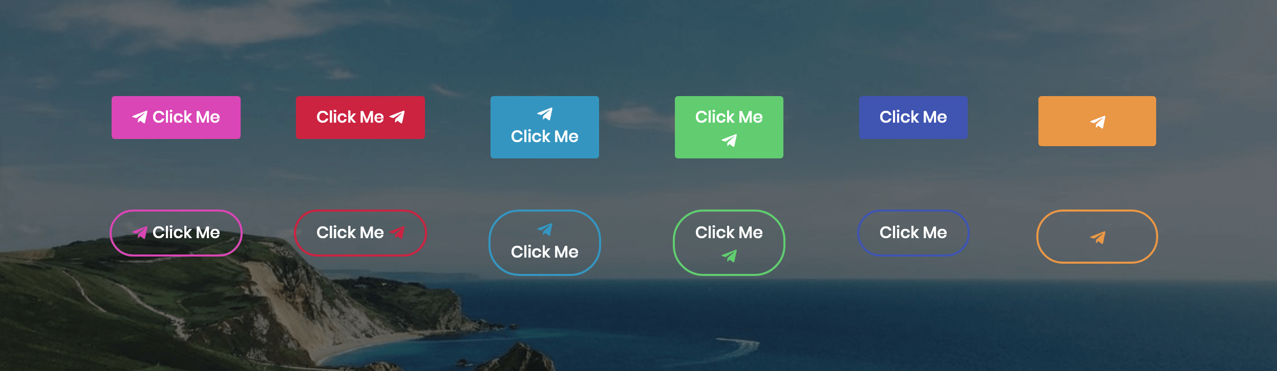
Dual Button widget Sample
On the picture below you can view Dual Button widget sample.
Content
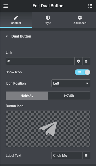
- Link – here you can paste your custom link to apply it to the button.
- Show icon – enable this option if you want to display an icon for the button.
- Icon position – here you can specify the icon button position (left, top, right, bottom).
Here you can switch from customizing Normal to Hover content settings. Just click on the Hover button to proceed to customizing hover elements.
- Button icon – here you can select one of the available icons from the icons list to use it for the button.
- Label text – type in your custom text to use it as a button text.
- Show Hover Effect: enable this option if you want to use a custom hover effect for the button.
- Hover Effect: here you can select one of the available effects from the effects list to use it for the button.
Style
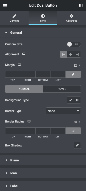
General
- Custom size – enable this option if you want to apply your custom height and width for the button.
- Custom width – here you can specify button width in px, em, and % for different devices (desktop, tablet, mobile).
- Custom height – here you can specify button height in px, em, and % for different devices (desktop, tablet, mobile).
- Alignment – here you need to choose the necessary button alignment (left, center, right).
- Margin – here you can define the margins for the button.
Switch from Normal to Hover mode to use different style settings for the button background when on hover or in its normal state.
- Background type – in this block you can choose, whether you want to use classic or gradient type for the button background. The customization options vary for each type.
- Border type – here you can define the type of the border you need to use for the element.
- Border radius – here you can set the border-radius to make the angles more smooth and round.
- Box shadow – enable this option if you want to access the shadow advanced settings for this widget, and need to apply shadow for it.
Plane
- Padding – here you can set the preferable custom padding for the widget. Fill in the values for the top, bottom, right and left padding in px, em, and % to apply your custom padding.
Switch between Normal and Hover modes to apply different custom styles for the button body.
- Background type – in this block you can choose, whether you want to use classic or gradient type for the button body background. The customization options vary for each type.
- Border type – here you can define the type of the border you need to use for the element.
- Border radius – here you can set the border-radius to make the angles more smooth and round.
- Box shadow – enable this option if you want to access the shadow advanced settings for this widget, and need to apply shadow for it.
Icon
Switch between Normal and Hover modes to apply different custom styles for the button icon.
- Color – here you can apply your custom button icon color using color picker tool.
- Font size – use the controls or type in the icon font size value in px, em, and REM in the corresponding block.
- Icon box width – here you can specify the icon box width value using the controls. You can also type in the value in px, em, and % in the corresponding block.
- Icon box height – here you can specify the icon box height value using the controls. You can also type in the value in px, em, and % in the corresponding block.
- Icon box color – here you need to set the color to use it for the icon box.
- Border type – select the preferable border type to use it for the button.
- Border radius – here you can define the value of the border-radius to make the angles more smooth and round.
Label
- Text Alignment – here you can define the preferable button text alignment.
- Margin – here you can define the margins for the button text.
Switch between Normal and Hover modes to apply different custom styles for the button label text.
- Color – here you can apply your custom button text color using color picker tool.
- Typography – turn the option on to view the typography settings.