 Last Update: May 29, 2025

Domain Search widget allows you easily to check domain name availability from your WordPress site. You can check or search for any generic top-level domains (gTLD) or country-code top-level domains (ccTLD).
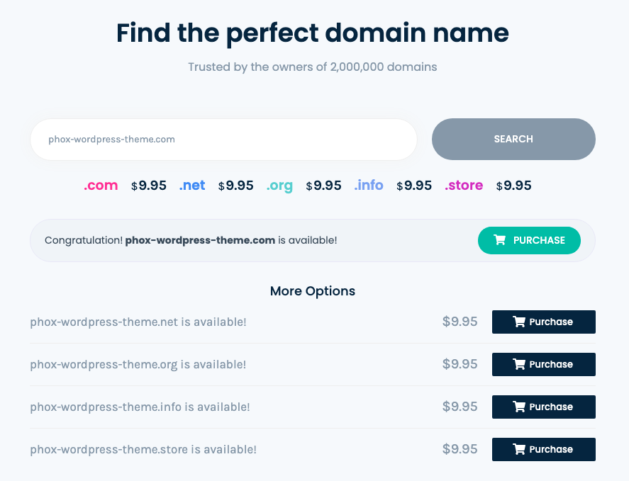
Domain widget Sample
On the shot below you can view the Domain widget sample.
Options
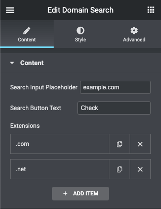
Content
- Search Input Placeholder – here you can set the placeholder of the search input.
- Search Button Text – here you can set the search button text.
- Extensions – here you can add all the extensions that you will support (* more options below)
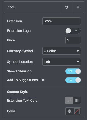
Extensions
- Extension – You must add an extension like that format (.tld) example (.com, .net) Not (com, net) and it is required filed.
- Extension Logo – if you want to upload a logo instead of display text.
- Price – Extension price is the only number and it is required filed.
- Currency Symbol – The extension currency symbol has more than 10 currency symbols and it is required filed.
- Symbol Location – You can choose to display the symbol after or before the price.
- Show Extension – If you want to hide or show the extension.
- Add To Suggestions List – If you want to hide or show the extension for suggestions result.
- Extension Text Color – in case you need to add a custom text color for a specific extension.

AI Suggestions
- Active: Switch it on to show the Domain AI Suggestions Tab
Settings
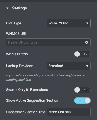
- URL Type – if you want to redirect your visitor when clicking the purchase button you have multiple options:
- WHMCS URL – if you choose WHMCS here you can add your WHMCS URL, for example (yourcompany.com/whmcs).
- Bridge URL – if you choose Bridge here, the user will be redirected to Bridge Domain Page (You must enable WHMCS Bridge Plugin)
- GoDaddy URL – if you choose Godaddy here, the user will be redirected to Godaddy Reseller Store Domain Page (You must enable GoDaddy Reseller Store Plugin)
- Custom URL – if you choose custom here you can add your custom URL.
- Whois Button – if you need to show the WHOIS button if the domain is taken
- Lookup Provider – In case you will not use the suggestion feature.
- Standard – You will use the internal functions to search for the domain.
- GoDaddy – You will use GoDaddy API to search for the domain but first, you need to add an API Key from the admin panel, for more info visit this article.
- Search Only In Extensions – in case you need to show the search results based on the only extension you added to the extensions list.
- Show Active Suggestion Sections – in case you need to hide the suggestions block you switch it off.
- Suggestion Section Title – in case you need to change the suggestion section title.
Style
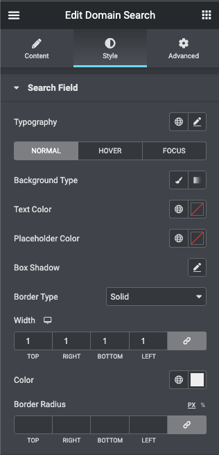
Search Field
- Typography – turn the option on to view the typography settings.
- Switch between Normal, Hover or Focus modes to customize the field text according to your needs.
- Background Type – in this block you can choose, whether you want to use classic or gradient type for the field. The customization options vary for each type.
- Text Color – here you can change the field text color to the one you want.
- Placeholder Color – here you can change the field placeholder text color to the one you want.
- Box Shadow – here you can apply the shadow for the field and change the shadow’s settings, such as color, blur, spread, and position.
- Border Type – here you can select the needed type of the border to use for the field.
- Border Radius – here you can set the border-radius to make the angles more smooth and round.
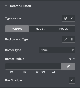
Search Button
- Typography – turn the option on to view the typography settings.
- Switch between Normal, Hover or Focus modes to customize the button according to your needs.
- Background Type – in this block you can choose, whether you want to use classic or gradient type for the button. The customization options vary for each type.
- Border Type – here you can select the needed type of the border to use for the button.
- Border Radius – here you can set the border-radius to make the angles more smooth and round.
- Box Shadow – here you can apply the shadow for the button and change the shadow’s settings, such as color, blur, spread, and position.
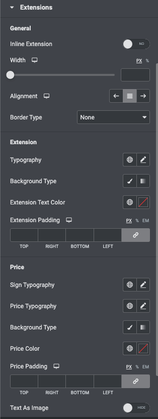
Extensions
- General
- Inline Extension – turn it on if you want to put the price and the extension on the same line.
- Width – Specify the minmum width for each extension.
- Alignment – here you can set the alignment of the extensions and make it different for different screen resolutions.
- Border Type – here you can select the needed type of the border to use for the extension.
- Extension
- Typography – turn the option on to view the typography settings.
- Background Type – in this block you can choose, whether you want to use classic or gradient type for the extension. The customization options vary for each type.
- Extension Text Color – here you can change the extension text color to the one you want.
- Extension Padding – here you can set the preferable custom padding. Fill in the values for the top, bottom, right, and left padding in pixels or % to apply your custom padding.
- Price
- Sign Typography – turn the option on to view the typography settings.
- Price Typography – turn the option on to view the typography settings.
- Background Type – in this block you can choose, whether you want to use classic or gradient type for the price. The customization options vary for each type.
- Price Color – here you can change the price text color to the one you want.
- Price Padding – here you can set the preferable custom padding. Fill in the values for the top, bottom, right, and left padding in pixels to apply your custom padding.
- Text As Image – if you enable this you can add a background into the text and customize it.
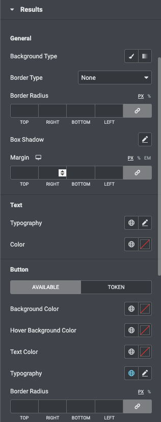
Results
- General
- Background Type – in this block you can choose, whether you want to use classic or gradient type for the results block. The customization options vary for each type.
- Border Type – here you can select the needed type of border to use for the results block.
- Border Radius – here you can set the border radius to make the angles more smooth and round.
- Box Shadow – here you can apply the shadow for the results block and change the shadow’s settings, such as color, blur, spread, and position.
- Margin – input the values for the margins in the required fields.
- Text
- Typography – turn the option on to view the typography settings.
- Color – here you can change the text color to the one you want.
- Button
- AVAILABLE
- Background Color – set the button background color.
- Hover Background Color – set the button hover background color.
- Text Color – here you can change the text color to the one you want.
- Typography – turn the option on to view the typography settings.
- Border Radius – here you can set the border radius to make the angles more smooth and round.
- TOKEN
- Background Color – set the button background color.
- Hover Background Color – set the button hover background color.
- Text Color – here you can change the text color to the one you want.
- Typography – turn the option on to view the typography settings.
- Border Radius – here you can set the border radius to make the angles more smooth and round.
- AVAILABLE
- Spinner
- Icon – set the spinner icon you have two options: to disable it or pick a custom one from the icons library.
- Icon Color – set the spinner icon color.
- Icon Size – set the spinner icon size.
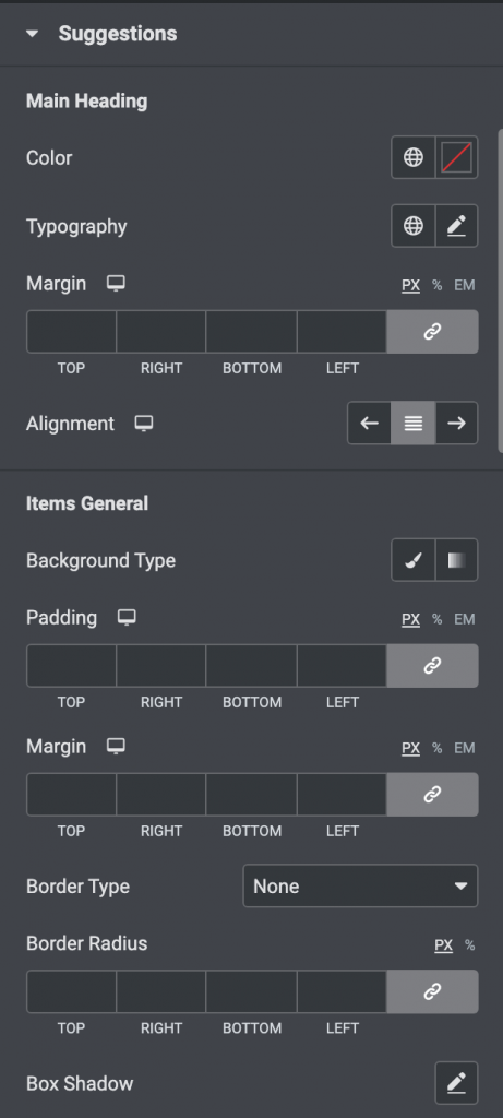
Suggestions
- Main Heading
- Color – here you can change the text color to the one you want.
- Typography – turn the option on to view the typography settings.
- Margin – input the values for the margins in the required fields.
- Alignment – here you can set the alignment of the heading and make it different for different screen resolutions.
- Items General
- Background Type – in this block you can choose, whether you want to use classic or gradient type for the items. The customization options vary for each type.
- Padding – here you can set the preferable custom padding. Fill in the values for the top, bottom, right, and left padding in pixels or % to apply your custom padding.
- Margin – input the values for the margins in the required fields.
- Border Type – here you can select the needed type of the border to use for the items.
- Border Radius – here you can set the border-radius to make the angles more smooth and round.
- Box Shadow – here you can apply the shadow for the items and change the shadow’s settings, such as color, blur, spread, and position.
- Item
- Background Type – in this block you can choose, whether you want to use classic or gradient type for the item. The customization options vary for each type.
- Border Type – here you can select the needed type of the border to use for the item.
- Border Radius – here you can set the border-radius to make the angles more smooth and round.
- Margin – input the values for the margins in the required fields.
- Padding – here you can set the preferable custom padding. Fill in the values for the top, bottom, right, and left padding in pixels or % to apply your custom padding.
- Item Text
- Color – here you can change the text color to the one you want.
- Typography – turn the option on to view the typography settings.
- Items Price
- Color – here you can change the text color to the one you want.
- Typography – turn the option on to view the typography settings.
- Purchase Button
- Background Color – set the button background color.
- Hover Background Color – set the button hover background color.
- Text Color – here you can change the text color to the one you want.
- Typography – turn the option on to view the typography settings.
- Border Radius – here you can set the border radius to make the angles more smooth and round.
- Icon
- Icon Color – set the icon color.
- X Position – set the icon horizontal position.
- Y Position – set the icon vertical position.
- Icon Size – set the icon size.
- Spinner
- Icon – set the spinner icon you have two options: to disable it or pick a custom one from the icons library.
- Icon Color – set the spinner icon color.
- Icon Size – set the spinner icon size.
Integrations
How To Use WHMCS With Domain Widget
How To Use WPForms With Domain Widget